
A better museum guide
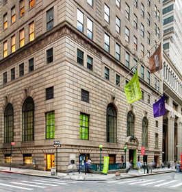
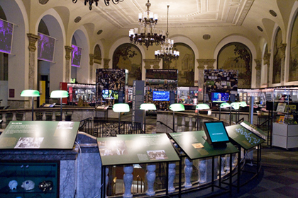
This small but fascinating Museum of American Finance is dedicated to money and economics. Part of the appeal is that it is located in the grand banking lobby of an early location of the Bank of New York. The old hall and current museum is one flight up from the entry and ticket counter. Museum visitors are handed a one sheet Guide and floor plan of the Museum (left below).
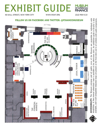
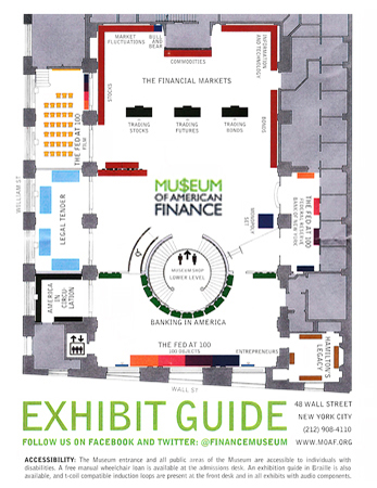
Part of the design process is to understand the user - the reader, viewer; the target audience. The museumgoer is often somewhat overwhelmed with being in a unfamiliar naborhood and entering an unfamiliar museum. Great museum materials help the visitor establish orientation and feel welcomed and comfortable in the space.
Improvements to the Guide (above right)

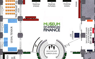
We are conditioned to expect north at the top. With EXHIBIT GUIDE at the bottom, it serves as the starting point for the user. From the entry in the rotunda, the user moves on up into the museum:


Design and critique work through the eyes of the user, the customer, the reader; not the client, and not the designer.
Epilog
I emailed a pdf of the improved guide and the link to this page on May 27, 2015. I received a reply on the 28th:
Thanks Jim. We're in the process of a design refresh here, so we'll take that into consideration.