
A few notes and sketches aboutdesign for urban environments
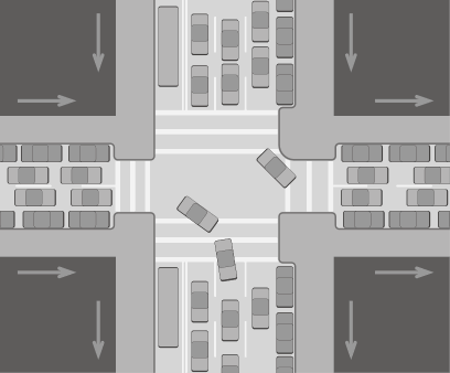
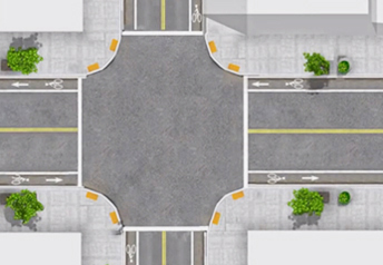
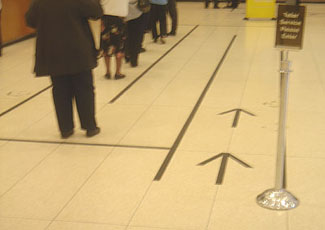
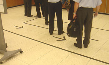
A better option for a downtown boulevard
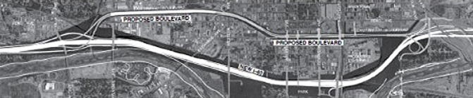
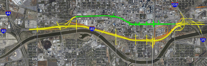
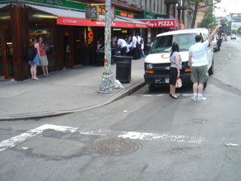
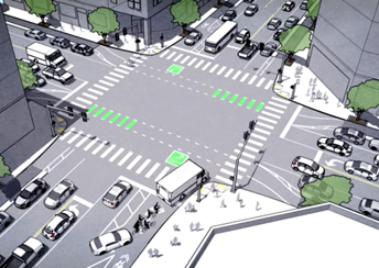
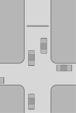
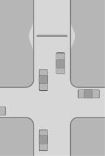
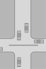
Constructed in 1965 Oklahoma City, the I-40 Crosstown freeway recently carried approximately 120,000 vehicles per day, nearly 50,000 over its intended capacity. In January 2012, a new rerouted I-40 opened a few blocks south. The old freeway was dismantled, leaving its right-of-way vacant. The prevailing wisdom would be that a boulevard would be built in its place. But, as the construction design was clarified, it seems that a section of it would be elevated where it cut diagonally across the grid of downtown streets. This caught citizens and even the City Council off guard - it was unexpected that the old elevated freeway would be replaced by a new elevated freeway. That didn't make much sense.
Several proposals were presented:
Shorten the elevated section so it is only a few blocks long. This elevated portion serves, as I-40 once did, as a visual, literal, and geographic divider and barrier to new developing areas of downtown. It would likely be counter-productive to improving downtown.
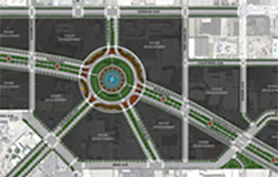
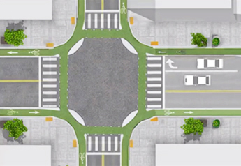
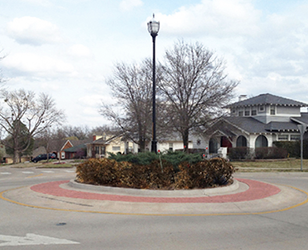
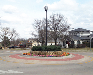
Build a roundabout/traffic circle joining city streets.
These proposals have some merit, but they still accommodate the old mindset - that there should be a continuous bypass connector off I-40 and back on.
Criteria for the old I-40 right-of-way
Feed commuter traffic to downtown
Improve access to downtown development
Decrease the impact of the car culture
Improve bicycle and pedestrian lifestyles
Respect the fabric of the city in its street grid
What does Oklahoma City really want from this project? I'm guessing they want to continue the momentum of developing downtown and providing more amenities for improving the livability of the city, not the drivability.
Audience of users
Office and work commuters
Restaurant goers
• Fans to and from the Arena
• Audiences to the Music Hall
Visitors to the library and art museum
Downtown residents
Convention attendees
Recreational users going to parks
Shoppers
Tourists going to the National Memorial and Bricktown
Conclusions
All of the above users need and want to access downtown, not to bypass it. Bypassing happens on the new I-40 freeway.
Drivers are not likely to exit I-40, stop at their destination downtown and then get back on that road and leave in the same direction. Almost all users of the new road will exit, stop, and return back in the direction from which they came.
The concept
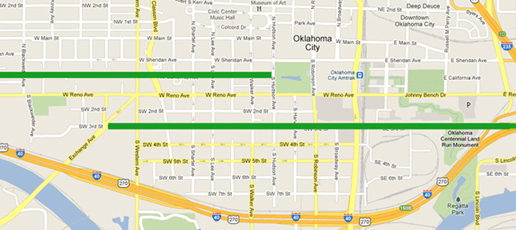
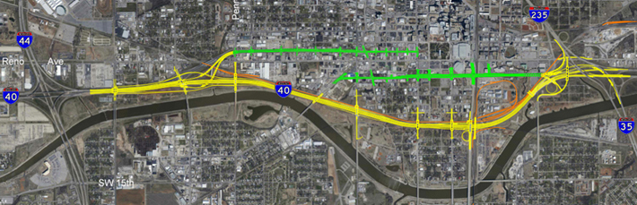
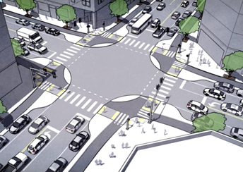
OKC has a predominant grid plan to its city streets. The grid was broken and severed in the 1960s by the then-new I-40. There is now an opportunity to restore the city to its earlier, more efficient, more visually appealing format. The diagonal 'gash' is removed and the city grid is restored. The concept is to develop two feeder streets from I-40 that serve downtown destinations (without disrupting the city grid) rather than bypass through downtown.
A street off I-40 from the west that serves Film Row and the Myriad Gardens.
• A street off I-40 from the east that serves the new Central Park and the Public Market.
Both streets feed the new convention center, the arena, and the new park.
This proposal requires a change of thinking, a fresh approach to the problem: Maybe there is no need for a boulevard along the right-of-way of the old I-40. A fresh approach is the attitude that Oklahoma City would be better served with streets adhering to the grid that serve destinations rather than bypassing them.
The city of Memphis opposed part of I-40 that would cut through a park and downtown neighborhoods. The land reverted back to the city and was developed into an urban neighborhood. In Manhattan, sections of Broadway (which also cuts across and disrupts the grid) have been closed and turned into pedestrian plazas. It has been very successful, returning parts of the city to the public and improving the movement of traffic on the efficient grid.
Important: Streets that cut gashes across an established grid require: more intersections, more stop lights, and more land used for concrete roadways. The angled cuts also cause a greater disruption to orderly traffic flow.
Advantages
Grids provide easier ways to navigate urban environments.
Emphasizes pedestrians, cyclists, and the downtown experience, rather than the automobile.
Probably cheaper to construct than the connector boulevard or traffic circle.
The remaining vacant right-of-way could be used as open green space or sold to developers to generate funds and spur further downtown development.
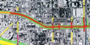
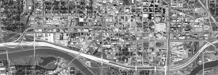
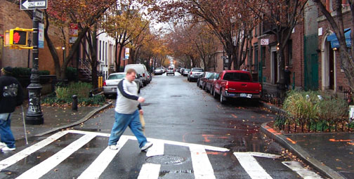
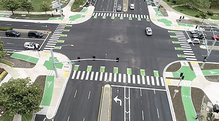
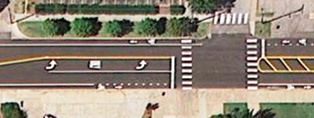
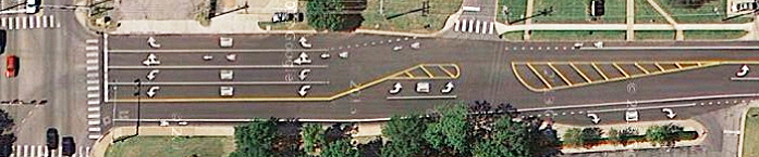
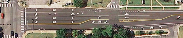
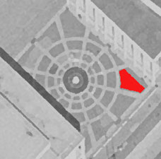
Comparisons: elevated diagonal and street level grid plan

On Tuesday, September 25, I emailed this essay to the mayor, each City Council member, the Director of Public Works, and the Downtown reporter for The Oklahoman newspaper. Of the 11 emails I sent to the OKC officials, I received only one reply, from Eric J. Wenger, Public Works City Engineer. The other 10? Nothing. Not even courtesy replies of receipt or thank you.
A few months ago, I sent emails about an issue in Manhattan to the City Councilwoman, Mayor Bloomberg, and Governor Cuomo. Within hours, I received a reply from each of them. Granted, they were most likely from an assistant, but they were still recognitions of a citizen's input.
Percentage of public servants replying to my emails:
NYC: 100%
OKC: 9%
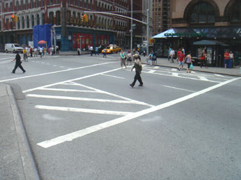
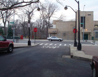
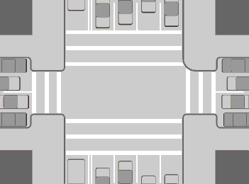
Some better intersections
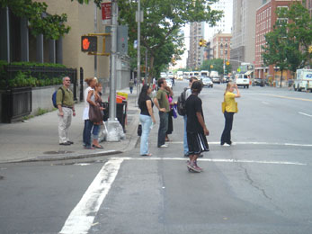
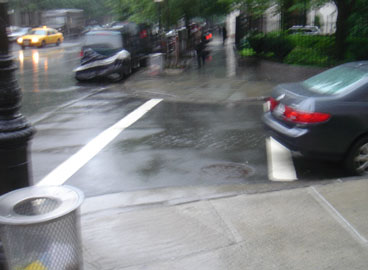
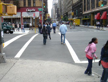
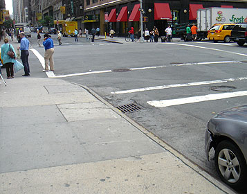
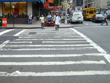
New Yorkers (and, I suspect, others in large cities) rarely wait for a 'Walk' light - they cross when it is safe to do so. They step into the street checking for traffic. There is this area in the street that is not used by vehicles driving or parking that people penetrate into. I explored how this space could be built to provide a safer area for pedestrians to wait before crossing the street. That evolved into using these larger peninsulas for signposts, bollards on the corners for protection, and enhanced bus wait lines.
Advantages of the improved intersections
1. Safer movement of vehicles and pedestrians.
2. More aesthetic.
3. Better placement of service modules - trash, info, signs.
4. More efficient and complete communication of information.
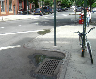
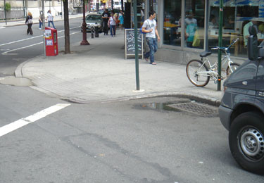
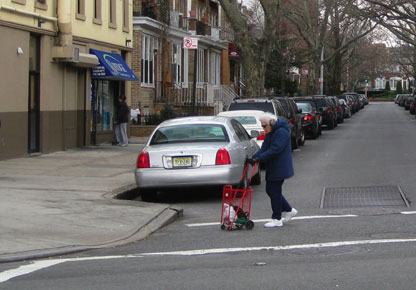
Pedestrian peninsulas
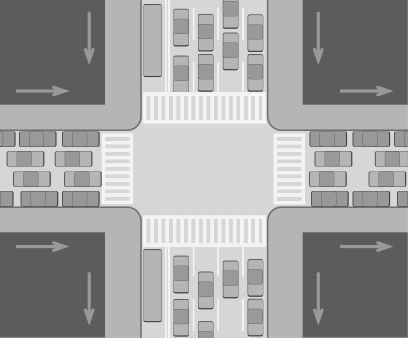

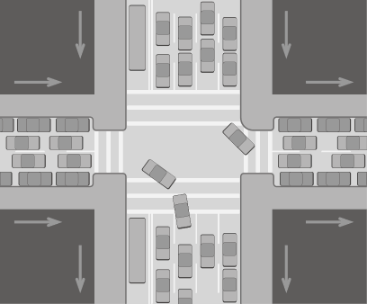
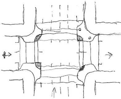
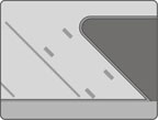
Normal intersection with one-way streets, bus lane, parked cars, and pedestrian crosswalks. Traffic pattern shows the light-colored space that is free of vehicles.
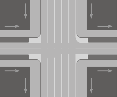
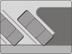
Proposal with pedestrian peninsulas that help control traffic and people. Version with parking along one side of the primary street.
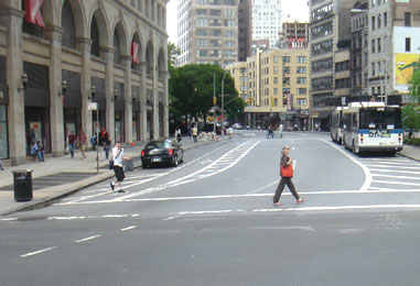
Examples of street space not used by vehicles that could benefit from pedestrian peninsulas.
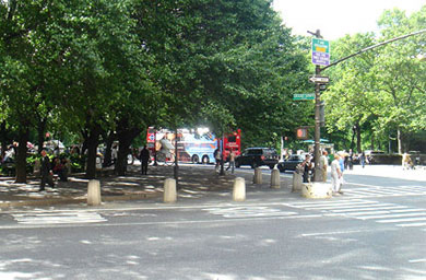
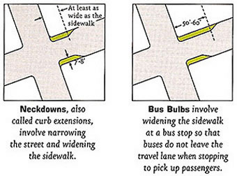
Example of present squared corner with bollards defining the sidewalk. Diagrams showing the peninsula concept, here called a 'neckdown' and a 'bus bulb', as devices used by highway engineers for traffic calming.
Examples of of curb neckdowns

Better left turn guides
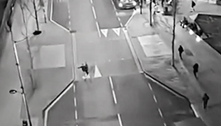
New York combed through more than 1,000 traffic-crash reports to better understand the dangers surrounding left turns. It found that left-turning vehicles caused 3 times as many pedestrian and biker casualties as right-turning vehicles. The city’s DOT found that left turns are dangerous for three reasons:
1. A car’s frame blinds its driver during a left turn, much more than during a right - poor visibility makes crashes more likely.
2. Drivers drive faster in left turns because they have a wider radius than with right turns - speed makes crashes more fatal.
3. Drivers cut corners during their turns - expanding the area where pedestrians can get hit - making a crash more likely.
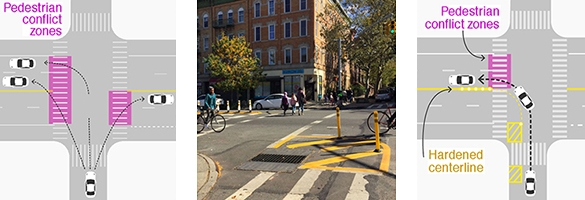
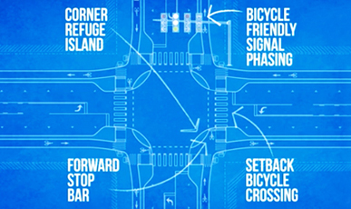
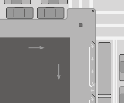
NYC DOT created a different intersection design to target these issues. The Hardened Centerline slows down drivers and discourages them from cutting corners and the Slow Turn Wedge uses markings and flexible plastic posts to buffer pedestrians from traffic and shrink the area where they could get hit by a car.
Protected Intersection design concept
This proposed intersection is a great idea - an intersection with segregated lanes for vehicles, bikes, and pedestrians.
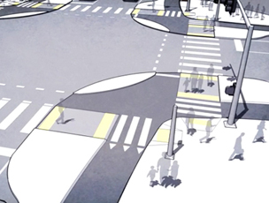
Below: A similar solution being used in Holland.
Below: From Fremont California
Bus queue lines
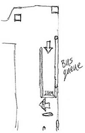
Close-up of one corner showing placement of signposts and bus queue rails. The dark line in the bus line represents a metal railing to protect the waiting passengers. The white parallel line is engraved in the sidewalk. It provides guidance on how to form the line without narrowing the sidewalk when there is no line waiting. Similar to these queue lines at Chase bank:

Samples of bus platforms along Broadway in NYC.
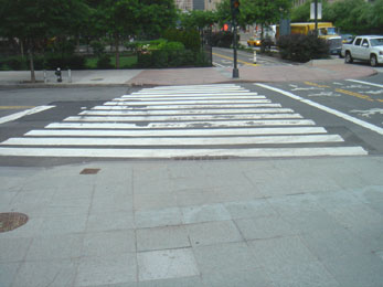
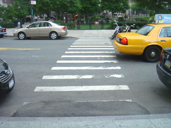
Improved crosswalk stripes
Striping the crosswalks parallel to pedestrian path keeps the users aligned, making it easier to get bearings in the crowd, to know direction, and to pass oncoming pedestrian traffic. Perpendicular to vehicle traffic makes them more obvious, as a barrier to cross - conveying caution, be alert. Three lines - two outer boundary lines and a center stripe - suggest a two-way lane, as we are accustomed to in roadways.
Stripes parallel to traffic flow make a more cumbersome walkway and are not oriented to help pedestrians.
Sketches
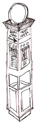

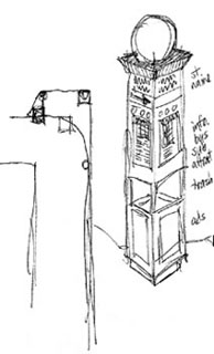
Sketch of a new signpost with, from top to bottom, light identity globe, street names, map and info of area sights, trash can with ads on 4 sides. Sample of existing info signpost on Broadway by Trinity Church.
Dates
Inspiration: May/June 2007
Sketches: June 2007
September 2007: New York City announced plans to install 'pedestrian refuges' along Ninth Avenue. These raised islands would make it easier to travel across intersections by shortening the distance required to cross the street.
Sidewalk conduits
Sometime during college in Austin in the 1970s, I took a photography class. For one of the projects, I photodocumented the visual chaos created by the myriad of telephone poles and electrical wires strung throughout the city. Wow - there is so much visual pollution in our cities. Poles that are at different angles with all sorts of wires draped from one to the next, transformers, phone lines, etc. In the country, telephone poles and cables strung along makes some sense. But, many communities and housing developments are now requiring utilities to be buried. That helps the visual ugliness, but it makes it difficult to access the utilities - utilities must be located under the ground and then yards must be dug up. But in the city - there's got to be a better way.
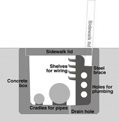
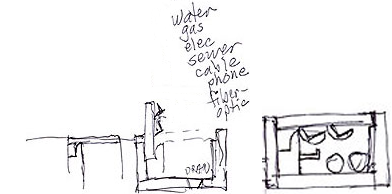
A large utility box buried in the ground along streets contains all utilities. The lid of the box serves as a sidewalk. All utilities are buried out of sight - no telephone poles with electricity, cable nor phone lines. Now its all underground. Placing all the utilities in the box allows easy access for repair, maintenance, and additions of new utilities. No more digging up the yard or street to get to buried utilities. The box has ample room for additional utilities - planning ahead for technologies that may come. Who thought about stringing television cable in naberhoods a few years ago?
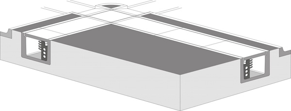
The box is prefab concrete in open-ended sections about 6 feet long. These are placed in trenches and aligned with each other and with the topography of the surrounding yard.
Along one side, away from the street, is a steel brace that supports the lid and the chases for the utilities.
There are holes in the steel brace to accommodate flexible water lines and electrical conduit.
Wiring chases or shelves are supported by the steel brace and run the whole length of the conduit. Wires, television cable, phone lines, etc. can be laid into these shelves.
The sidewalk lid rotates up and into a cavity in the steel braces. There are no moving parts to wear out - no hinges, pistons, or lifting mechanisms. The lids are too heavy for anyone to lift - it requires a hoist on a truck that travels down the street lifting the lids long enough for a crew to add or repair utilities in the conduit.
On the floor of the conduit box are braces to support water and sewer lines. Periodic holes allow rainwater to drain into the sand and soil base under the boxes.
With the utilities inside and protected within the box, there is no need for telephone poles.
Disgust with visual pollution: 1970s
Concept: 1990s
Sketches: Summer, 2006
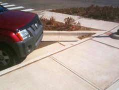
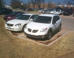
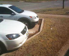
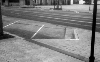
A better way to build parking lot curbs
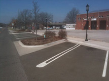
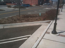
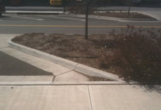
Shown above is a typical way to pave curbs around parking spaces. But this system creates an acute angle that collects trash and minimizes the area for landscaping or sidewalks.
Once the right front tire hits the curb, a car can't go forward any further. Notice in the sequence below how that leaves a triangle of wasted space. That point where the tire hit the curb can determine a line perpendicular to the front axle. Sketched: March 2010

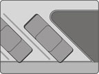


Advantages
There is no acute angle to trap debris.
Easier (and cheaper) to pave without the acute angle.
There is more area available for landscaping.

A better location for a speedbump
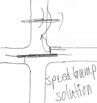
Traffic in our town is pretty chaotic due to rapid population and retail growth and poor short-sighted planning by the city. A secondary road by my house feeds into the university and serves as a shortcut between major arteries. The city wanted to slow down the traffic on this street. They installed some speedbumps (shown above, middle). Drivers, however, already in a frustrated state due to traffic congestion in Edmond, solved the problem - they just drove around the bump. There are no curbs to prevent such drive-arounds. However, that killed the grass in the adjacent yards, angering those homeowners. Meetings were held to address the concerns of homeowner's and area residents. Two city council members were present. One admitted what caused the problem, "We just didn't think about it." It was refreshing to hear a politician be honest and acknowledge why there are so many inadequately resolved issues in our community. By a show of hands, we residents voted to have the bumps removed.
Above right: a more effective solution - simply lengthen the speedbump and locate it in the adjacent intersection. This will prevent cars from driving around it. While it will cost slightly more for the extra length, it will effectively serve as a deterrent without compromising resident's yards.
Installation of speedbumps: March, 2009
Sketches and development: May 28-30, 2009
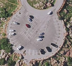
Less chaotic parking

Restriped streets to add lanes and clarity
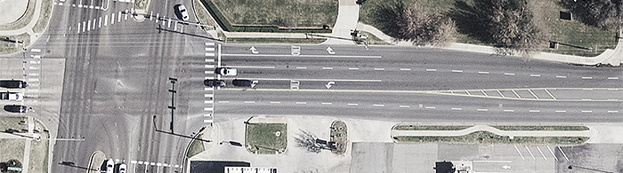
Losing the dedicated Right Turn Lane to add a 2nd Left Turn Lane.

Below left: there is a missing crosswalk and the turn lane is too far away from the intersection. Below right: Improved.
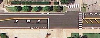
In the photo above, notice the wasted areas in the yellow-striped islands. Below: there is enough room to add a lane.
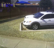
An unsafe roundabout planter
In 2012, a roundabout was restored to the intersection at 4th and University. During the phase of getting used to a planter in the middle of the intersection, it was rammed several times late at night, probly by alcohol-impaired drivers. As the Parks Department rebuilds the rock planter again, this would be a good time to consider replanting the roundabout to be more safe.

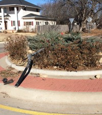
Left: Most of the year, the rose bushes just create a dark mass at the base of the lamp post planter. At night, this dark mass makes the planter almost visually disappear. The stone wall was originally very well done - a nice counter to the green plantings. But the rose bushes obscure the stone wall (and subsequent run-ins have altered the wall's appearance).
Suggestions: Remove the rosebushes, replace them with very low flowers or ground cover, and rebuild the stone wall. This will allow the light rock to be more visible and better convey a forbidding rock barrier (drivers may not be as likely to hit a stone wall if it is more visible and obvious).
The goal is to make the roundabout planter more visible, and, therefore safer.
Additional benefit: The smaller planting footprint will also decrease the blind spot on the opposite side.
In 2015, I sent the above info and photos to several city administrators. In 2019, the lower tier of plants was replaced by some simple yucca plants, thereby opening up the views around the planter. Much better.
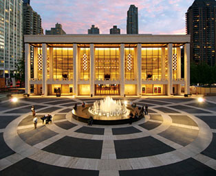
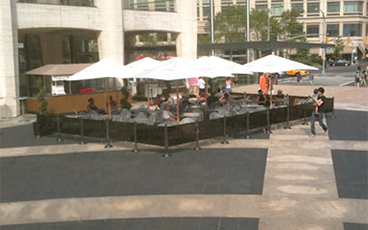
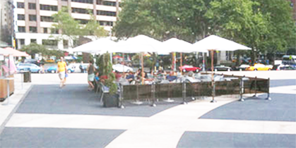
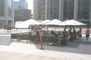
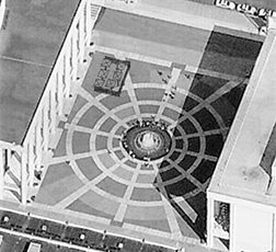
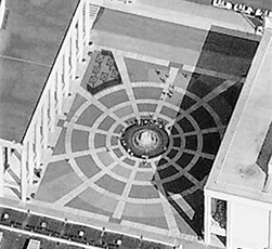
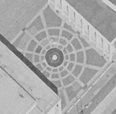
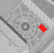
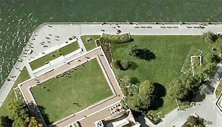
A better seating arrangement on the plaza at Lincoln Center
Lincoln Center in New York City is a campus of 12 performing arts and educational organizations. The main entry to the entire campus is the open public space with its central Revson Fountain set into a distinctive patterned pavement designed by Philip Johnson. The Plaza pavement masonry was renovated and the Fountain enhanced with lighting and technical upgrades. On the plaza are often seasonal food carts and a seating area. The arrangement, however, of the seating area and its surrounding fence ignore the patterns and lines of the plaza and the fountain.
Design objectives
Integrate elements to enhance the overall environment.
Respect and emphasize existing architectural elements.
Empathize with the user and with the pedestrian point of view.
A better layout would be to align the fence barrier with the dominant patterns in the plaza. The umbrellas could be aligned on the gird formed by the surrounding buildings, thereby integrating the seating area to both the plaza and the buildings. The proposed arrangement allows the Philip Johnson-designed plaza to maintain its original design integrity.
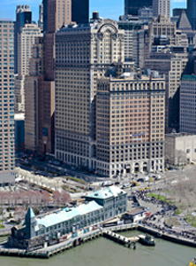
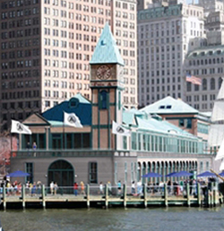
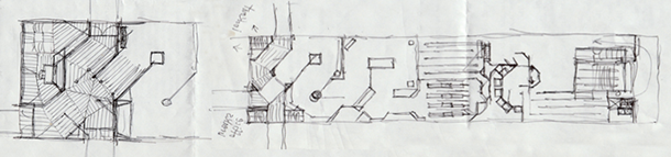
A better Statue of Liberty Visitor Center experience
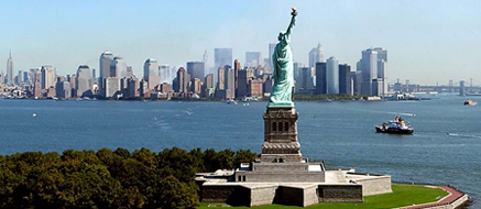

Visiting the Statue of Liberty is one of the most popular visitor experiences in New York City. Since 9/11 and the implementation of heightened security procedures, there hasn't been a great way to manage and educate the crowds of visitors. A tent was set up to contain the security scanners, but the long line of people queues up outside in Battery Park. Tickets are sold at a separate nearby site - the old Castle Clinton historic site. But, a better solution has been sitting in Battery Park for many years.
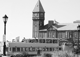
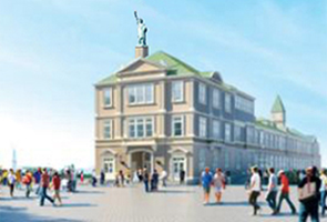
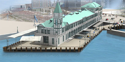
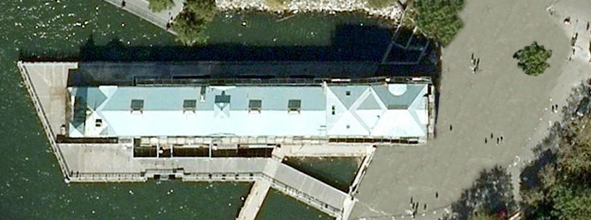
Pier A, the only remaining Victorian-era pier along the Hudson River, can be repurposed as the home for the Statue of Liberty experience: selling tickets, queue line, security scanners, historic exhibits, boat boarding, and souvenirs and food service.
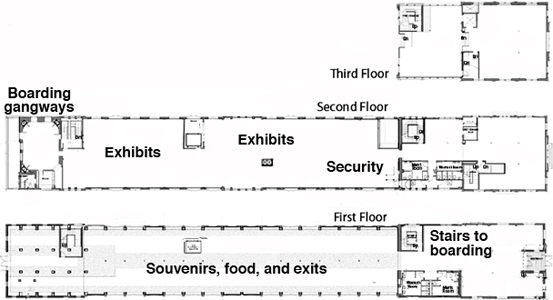
Imagine the complete immersive immigration experience - it starts as the guest approaches Pier A and sees the period architecture. Inside are a foyer of ticket booths, stairs, escalators, and elevators to the second floor. Up on that level are exhibits and the security checkpoint, more exhibits, and a crowd waiting area replicated to imitate the immigrant experience. The boarding area is patterned after European docks of the 1920s. The interior design conveys the crowded sense of waiting to board a ship for the New World. Two or three gangway boarding walkways extend to the second level of the ferries. This allows simultaneous boat exit and entry - guests exit the boats on the lower level and enter the boats on the upper level (where most guests end up, anyway) - this will speed up the transfer of visitors.
The ferries then sail across the harbor to the sight of the statue, just as many immigrants experienced her. The boat vessel has a mutimedia presentation to recreate an immigrant's voyage and arrival. There could be large screens playing videos of recreated immigrant boarding and sailing scenes. Then when in view, the screens could give way to the actual view of the Statue in the harbor - just as immigrants caught a glimpse of it. Then on to Ellis Island. The debarkation docks on Ellis and Liberty Islands continue the period look. Another sight is the Jersey City train station where most immigrants arrived by ferry from Ellis Island and caught a train to a new life in Chicago, Cleveland, St. Louis, and up and down the east coast. Upon the return voyage and debarking the boat, the guests exit down a wide gangplank and through the first floor of Pier A where there are gift and food kiosks, seating, and views of the harbor. The enhanced experience turns the Statue visit into an event, a show worthy of the half-day time requirement.
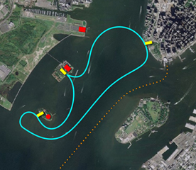
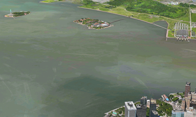
Routes of the ferries from Pier A to Ellis and Liberty Islands. Pier A is at the tip of Manhattan in the upper right. The red dots are, from top to bottom, the Jersey City Train Station, Ellis Island and the Immigration Museum, and the Statue of Liberty. The orange dotted line is the route of the Staten Island Ferry.
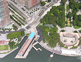
Right: Pier A is the light blue dot in the lower right.
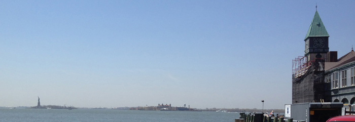
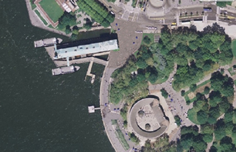
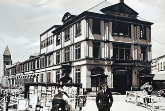
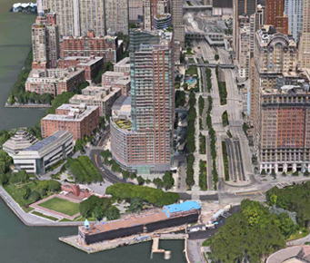
The building: Pier A, the Statue of Liberty Visitor's Center
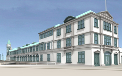

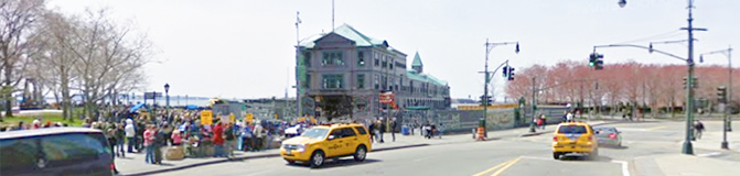
The entry plaza has ample space for crowds without compromising Battery Park.

Advantages to the Pier A Plaza Visitor Center
• Pier A allows the entire mainland experience to be consolidated in one embarkation and exhibit building, providing a landmark identity.
• A larger, more visible, entry plaza on Battery Place allows easier traffic flow of visitors from buses, taxis, and subways.
• Moving the ticket booth out of Castle Clinton frees it up for historical exhibits, a more appropriate and respectful use of that building.
• Battery Park is rid of the temporary white tents and tacky crowd barricades.
• More of the Battery Park river walkway is opened up for better vistas of the harbor.
• Security checks can be conducted in a more secure and less obtrusive environment.
• The queue line is indoors, out of the weather elements. Videos and exhibits can occupy the attention of those in line.
• Space for immigration/Statue exhibits is provided for waiting visitors and for the many people who choose not to visit the statue or arrive too late to get a ferry ticket.
• Two-level loading and unloading speeds up the process and shortens visitor waits.
• Space is provided for vendors of food and souvenirs, protected from the elements.
• A landmark for the experience is visible from along West Street, Battery Place, and Battery Park. A miniature Statue on the top of the flagpole on the Pier A roof provides a strong and familiar visual reference.
• The cohesive continuity of buildings: Liberty Island, Ellis Island, Jersey City Train Station, and the new Pier A Visitor's Center become major components of a comprehensive Immigration Experience.
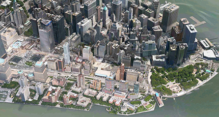
Pier A juts into the bay on the lower right (blue roof), 9/11 Memorial is left center, Staten Island Ferry is right center.
Enhanced visibility at the edge of Battery Park and at the foot of West Street that runs up the Hudson side of Manhattan. The WTC and 9/11 Memorial are a few blocks away.
Idea and sketches: 2009.
Presentation: 2013
Other options for Pier A
LoMa Museum Downtown, or Lower Manhattan, needs a comprehensive history museum. The most historical part of the metro area is within a few blocks of Pier A: early Hudson shipping and piers, Battery Park, early naborhoods, Castle Clinton, Statue of Liberty, Governor's Island, Customs House, Bowling Green, World Trade Center, City Hall, Park Row, Woolworth Building, Wall Street, Fraunces Tavern, Stone Street, Delmonico's, and many more significant sights. Pier A is well located to serve as a starting point to explore downtown.
Visitor's Center: Ticket Booths, Restaurants, and Gift Shops. In the front section could be ferry tickets, harbor cruise tickets, the TKTS booth (move from the Seaport or add a third location). The second floor with its great views of the harbor could accommodate at least two restaurants. The entry level could contain gift shops to take advantage of the mass amounts of tourists.
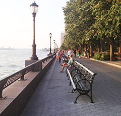
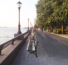
Wider walkways with no additional land

Just move the benches closer to the seawall. Grouping them into sets of 2, rather then 3, allows easy access to both ends of each bench - there is less need for an access aisle along the seawall railing.

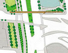
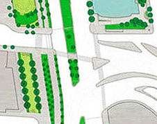
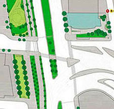
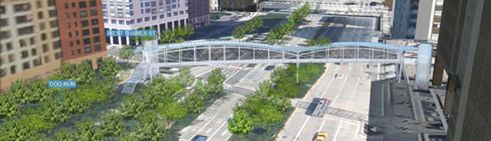
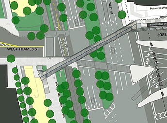
The West Thames Pedestrian Bridge over West Street
The intersection of West Thames and West Street connects the NYC Financial District to Battery Park City. This is also where the Brooklyn Battery tunnel empties into Manhattan. Here are 3 pedestrian crossing options:
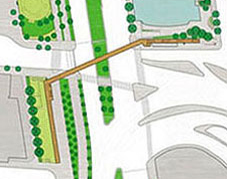
In June of 2009, a 21-million-dollar pedestrian bridge at the intersection of West Thames and West Street connecting the Financial District to Battery Park City was announced.
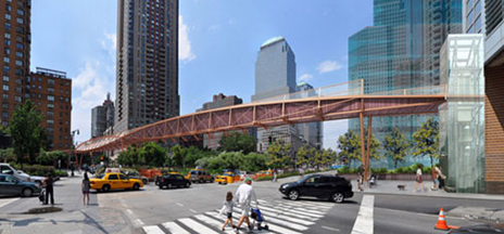
The bridge has 3 angled sections with an elevator and ramp at one end, and stairs & ramp at the other. This plan:
Adds to the literal and visual chaos of the intersection.
Requires the removal of an entire row of trees.
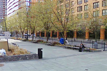
Removes shade from one side of the dog park.
Does not integrate into the order and alignment of the naborhood.
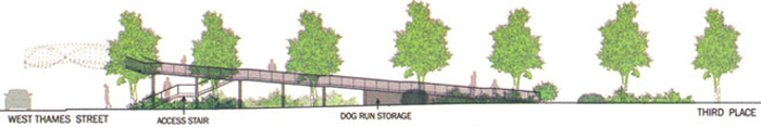
Above: Elevation of the bridge ramp and staircase along the dog park. Below: The row of trees that will be cut down.

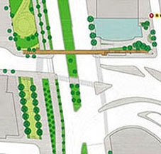

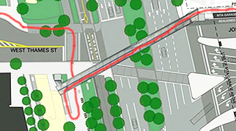
In this more obvious and intuitive solution, the bridge goes straight across West Street and terminates with an elevator and a staircase on the west and an elevator and ramp or stair/ramp on the east. A few advantages:
While it may seem hard to integrate the philosophies of organic architecture in an urban setting, the existing sidewalk locations, dimensions, and curves look custom made for the western landing to be on the north side of Thames Street. That side better respects and maintains the fabric of the naborhood by integrating the bridge with the alignment of the existing street and building grid.
The new bridge will serve the residential buildings along Rector Place, South End Avenue, Thames, and Battery Place. Residents farther south will likely use the crosswalk at Battery Place or 2nd Place/Morris Street. As residents from Rector Place and West Thames walk to the financial district or to the subways along Rector Street, many will not have to cross Thames Street.
The distance of the bridge span would be as short as feasible, thus requiring less material.
Option 2 would be the most convenient for the most people, fit the site better by respecting the existing grid and alignment, enhance the naborhood aesthetics and quality of life, maintain the most existing trees, and be more cost efficient.
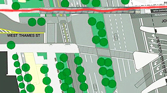
This option acknowledges that crossing the intersection, with barriers, stoplights, crossing guards and a nearby police presence is quite safe and convenient. The State Department of Transportation has added some traffic-calming features, including colored crosswalks, more than 500 trees in the median, additional time for pedestrians to cross, countdown signals, and reducing the speed limit from 35 miles per hour to 30.
The city cannot guarantee anyone's safety. People should take responsibility for their safety - making smart decisions at busy intersections. They should guide and set an example for their children.
The intersection is already quite safe - traffic signals with Walk and Don't Walk signals, concrete and stone barrier walls, protected median landing, landscaping, recently funded crossing guards, and police officers within a few yards. There is no evidence that the intersection of West Street and Thames is dangerous.
With or without the bridge, school kids have to cross a street before they get home. This particular intersection is quite safe for any person taking responsibility and paying attention to the signals.
This option would save the city millions of dollars.
6 years later: Proposal #2
The 2009 proposal never got adequate funding, went through a lengthy public design review, and hit some bureaucratic and design snags. The snags were finally resolved and a new proposal was presented in 2014. The revised West Thames bridge is a 240-foot-long concrete and steel structure with a glass roof and is expected to cost $27.5 million (not including any certain-to-come overcharges). It will be accessible by stairs and elevators on each end. With no ramp along the dog park, fewer trees will have to be removed.

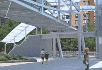
Above left: In 2015, the canopy over the staircase was deleted. Below left: Proposed layout. Right: Option that is cheaper, requires removal of fewer trees, better respects the urban grid, is visually more appealing, and provides a more convenient walking option.


Alignment of ornamentation bands: Across 5th avenue from the Met and downtown in the Financial District.
www.jamesrobertwatson.com/design-urban.html