Tips for better logo design
A logo is a graphic signature and helps create a strong visual image to establish company or product identity and recognition.
First created by Chinese calligraphers in about 2000BCE, logograms were calligraphic characters that represented a sound or word (such as the ' &'). Today the design and production of corporate identity programs is big business. Great logos are appropriate to their task, clearly convey the intended message, have meanings behind the symbolism, integrate the text and image, and have thorough rationale supporting each design element in the piece.

Above left: In English, the word chaos requires 5 separate symbols. The Chinese had so many characters in their alphabet that, around 1,800BCE (a really long time ago), they developed single calligraphic characters that stood for words - the mark, above right, is for chaos. The single mark was more efficient: easier and quicker to render. It was called a logogram, meaning written word - written = gram, word = logo. The term stuck and, today, we still refer to marks of identity as logograms, or more commonly, shortened to just logo. Some people also clarify the type of logo with these terms:
logomark - a logo that is primarily image-based
logotype - a logo that is primarily text-based
logogram - a general term for an identity mark
logo - same as above, but with fewer letters in the term
Synonyms
Common: identity, logotype, trademark, symbol, mark
Less common: logogram, icon, pictogram, logomark, isotype
A logo can be unaltered type, manipulated type, a symbol or visual, or a combination of type and visual. If a logo/identity consists of both type and visual/image, the two should be integrated to allow easier comprehension and memorability. A company's name is often part of their logo; an ad slogan or address is not.
Great logos convey the essence of what the company/entity is about. usually, they're not literal images of products, but more of the feeling one gets or the attributes associated with the company. A restaurant logo will likely not show food, but it will convey cleanliness, sophistication, tastefulness, etc. A logo for an insurance company won't show a paper policy to fill out but will convey professionalism, trust, integrity, etc.
It is quite common for design students and poor designers to design a logo that emphasizes the initials of the client's company. A logo should be something that the viewer will identify with that company. If the company isn't known by its initials, then do not create an identity of its initials - communicate the correct name of the company - what people will say, not a cute acronym nor initials. There are no great logos of initials only. IBM, UPS, AT&T want us to know them by those names. Those are the new company names - they are no longer initials.
Logo/identity critique checklist
A great effective logo should meet many of these criteria:
Readable, legible, and easy to comprehend.
Suitable for the company's audience and purpose.
Impacts a strong lasting impression.
Unique from marks of other businesses.
Will last over time and not be dated to one trend.
Professional quality production.
Adapts to a variety of uses, surfaces, and media.
Retains clarity in a variety of sizes and applications.
The bottom line
• A great logo is an effective identity, not an ad.
• A great logo is a brief identifier.
• A great logo has type and image that are integrated (unless it is image only or text only).
• A great logo conveys a message/feeling/essence clearly.
Some great identities
Commonalities: few graphic elements, some wit or cleverness, a barb for memorability, and clear communication of the meaning.


The above 4 are by Jim Watson. More here.


Saw this logo on the left for a radio station in NYC (natch). It just didn't sit right - there were some elements nagging. The underline beneath the W didn't match the columns of the other letters and the stagger was abrupt from the W to the N. I got the concept immediately - emphasizing the NYC and setting them as a unit distinct from the W.
In my head, I saw a taller box under the W and some tweaking of the other columns. The W sitting right on top of a red box, the N centered in the top of another box, the Y breaking the top edge and seeping its contents out into space.
When I checked online for other variations of the logo - there was the logo in a red square - it confirmed the decision to put the W atop a square. It was consistent and now made more sense.
The improved version has a bit more logic and more eccentrics to help aid memorability.


Making this logo better was an easy one


Not often do we see a brand that just doesn't work. This is one of those. The dominant horizontal slabs, the font, and the kerning are all too clumsy and visually awkward. The thick and thin letterstrokes are a bit too extreme. Notice the white masses formed where two or more letters with thick vertical strokes are next to each other (like the MBL of Assembly).
Solution: simply replacing the font with a condensed sans serif helps convey the industrial heritage of the facility and improves the legibility and the readability. The notion of setting the text in a condensed sans serif comes from the Jones Assembly graphics program, examples below:


They have already established condensed sans serif as their 'corporate' brand type. It was an easy transition to use it in the brand. A major influence on the success of a brand is consistency of application. Jones Assembly uses so many condensed sans serif selections in their pieces that it is a short jump to add the logo to that mix.
Compare the existing and improved brands on a Jones webpage:


The improved version also resembles the 'hamburger' symbol that denotes a Menu on a webpage. Recognition of that common symbol on websites could evoke a connection to The Jones Assembly.
Info: The hamburger button (sometimes called options, hotdog, pancake) is a button placed in a top corner of a graphical user interface. The icon consists of 3 parallel horizontal lines, suggestive of a list, and is named for its resemblance to the layers in a hamburger, pancake, or a hotdog in a bun.


Tapping or clicking this button reveals a menu. The icon originated to save space on smaller devices - tablets and smartphones. On devices with even smaller screens, the wider hamburger button may be reduced to three vertically stacked dots (a tri-colon or vertical ellipsis) described as a kebab. The hamburger icon was designed by Norm Cox as part of the user interface for the Xerox Star workstation in 1981, and saw a resurgence in 2009 stemming from the limited screen area available to mobile apps.
How to make the new Met logo even better


Above: The former logo for The Metropolitan Museum of Art (everybody refers to it as the Met) in New York City featured a drafting rendered letter M, adapted from the 1509 book De divina proportione by Luca Pacioli. But, as The Met moved its modern art collection into the former Whitney Museum building - a Brutalist classic by Marcel Breuer - now called The Met Breuer, the former logo would no longer be appropriate. There needed to be a new brand to better convey the new Met. A logo with images would be tough - how could they represent such a vast collection spanning thousands of years and hundreds of styles and genres of art with just one or a few visuals?
In early 2016, The Met introduced a new logo - conjoined letters that "connect the past with the future." The museum's VP of Marketing says, “The Met represents over 5,000 years of art, from all over the world; at Fifth Avenue, the Breuer, and the Cloisters. This notion of trying to make the connections - it was what drove the look of the logo." The conjoined letters connect the past with the future. But, that concept could/should be carried a step farther - to not only connect the letters horizontally, but also vertically. Connecting the past with future in a linear timeline and connecting the depth of the collection into a single entity.


Improvements
• Letters touch vertically as well as horizontally.
The thick stroke of the H aligns above the thick stroke of the lower E.
Serifs are vertical, not slanted or skewed to respect the verticality of the thick letter strokes.
Thin lines in the font are a bit thicker to better relate to the thick strokes and provide more strength to the logo.
The 'barbs' of the missing serifs on the Ts remain for increased memorability.
The left and right margins align, forming a better frame; as art is framed and highlighted.
The revised mark is more orderly, more cohesive, and more connected (which is the main design concept).
Lesson: Figure out the strength of the piece, exploit that and minimize the rest.


Some applications


Below: In 2017, TheMet adopted some of the better concept - the kissing lines of type. Now just one step further to the brand:


Tweaking the GEICO logo a bit

This logo - that we've seen in numerous television and print ads - is almost there. There is a strong penchant to be symmetrical with 4 massive letters and a thin letter I right in the middle. But, as shown in these images:
the left side is not quite the same as the right. The version below is better - the e now better matches the G C O with rounded corners. The symmetry, unity, and consistency of the masses is improved and the kerning between the letters is a more comfortable - a bit more breathing room and respect for the letterstrokes and the counters.


Reader Jason from the Washington DC area submitted this logo - he commented that it just had too much going on. It is an identity used in the campaign for Mayor of Phoenix.
Better version right - simpler, clearer, more memorable. There is one memorable image and text.
The image of the bird is tucked around the text for a better connection and relationship.
Rise Together (in a sloppy inappropriate font) has been deleted. This slogan can be used in ads and posters, if necessary.
For Phoenix is smaller to allow Sarwark to be more prominent - Sarwark is the single most important word to be remembered.


The logo for the Morning Edition on NPR is okay, but there are some concerns:
Two rising suns? Don't most of us think there is just one sun?
Rising above the horizon? The baselines of the letters form an implied horizon, but the bottoms of the suns are above that horizon.
Fat outline sun? The sun is solid, isn't it?
The concept of representing the morning sun is valid. There is no good reason to put a 'barb' (the rising sun) in the word 'edition' - it is less significant than 'morning'.
Below: another existing version that is set on one line and a better.


Making the Little Free Library logo a little better
No books left outside on the bench.
Tree farther away from the bench.
The Library box is on a narrower, more accurate post.
The LFL title is on the spine and the grass is the cover of a book, with elements (tree, bench, library) popping up.
The web suffix, .org, is removed.
The text is kerned more evenly, especially at the leg of the R.
Both lines of text are the same width.
Replaced Return a Book with Leave a Book. Return suggests the borrower should return the book taken - actually, they can replace it with any book. Leave a Book opens submissions to new and more books.


Above: New logo on a redesigned website. Below: in an email newsletter:


Existing logo above left. Below left: the text portion of the existing logo. Below right: Improved version, text only, no inappropriate and unnecessary drawing, it's shown above right just to compare the two logotypes. The improved logo has character more fitting for Western Heritage.
How it looks on the website. Also with redesigned info of Hours, Admission, and Location:


I'm just not sure if all 3 Es could be alike.
Better connections among elements


Existing logo left, improved logo right. The 3 elements (1 mark and 2 lines of text) do not seem to like each other - they certainly don't respect each other. The awkward long arms of the F - push the OWLER away. Automotive is not aligned with (does not respect) the Fowler typography. A strong logo should be read as a single unit with all elements being part of a cohesive whole.
Better unified mass


Tightened the letter spacing in Evoke.
Better related the drip to the the counter of the O.
Raised the drip to convey fresh - right out of the pot, cup, or brewer.
Tightened spacing, enlarged, justified, and raised text copy.
A nice concept that got overwhelmed


There's too much going on here - to make this logo better, it needs to be simplified.
Clever: a flag that is also a 7. The 7th flag. The flag is enhanced by the waving motion providing movement and depth. That's good. But the motion and depth is ruined by placing the flag within a solid black diamond. That just crushes it. The CO. is set smaller and placed inside a circle (like the copyright symbol?) Now, the word, company, stands out as the most important word - it is set differently from the other words and emphasized with a circle outline. And, yet, it is the least important word.
Below: The logo in these iterations show that there is not much design sensitivity associated with 7thFlag Coffee. No day of the week, trendy vertical marks to separate words (that was passe as of about 2012). But the silliest: The flag 7 is supposed to be read as an 'I' (or a '1') in the word 'First'. The education invested in seeing the flag as a 7 is crushed when the reader is now supposed to see it as an I, not a 7. In the example on the right, the craftsmanship is weak in aligning the words to the swashy baselines. And why are there now two small hyphens on the Coffee Co. line?


The logo probly needs an entire makeover (keep the 7/Flag concept). But, to show a better version with minimal input, below is a version that is stronger. Now the flag conveys leading a charge, as at Goliad. There is a single primary element, more depth, and much more motion. And the 'Company' abbreviation is not dominant.

A better branding program for WhichWich
The existing mark is too busy, clumsy, and disparate; it should convey these objectives: cleanliness, order, clarity, ease of use, caring, and cheerfulness. Improvements:
Delete the question mark. Reserve it for use on 'Which wich?' at the point of ordering at the menu boards and during interpersonal relationships from the Host/Cashier: "Would you like chips with that?" "Would you like a drink?" The brand that is seared into the customer's mind has no question mark and the customer doesn't ask a question when saying, "Let's go to WhichWich!" "I love WhichWich." From their viewpoint, there is no need to question and it becomes slightly confusing.
Delete the rectangular box (the 3d text image is diminished by the 2d box) and the capsule shape.
Align elements to form an implied rectangle.
Improve the consistency of the letterstroke widths.
Tighten up some of the awkward letter spacing.


Below: the refined logo with border treatments. A rectangle with rounded corners respects the round vibes and capsules and allows the letters to remain Wich yellow. The border is a thinner line than the existing logo (now about the same visual thickness as the letter strokes) - to be more subtle, to not detract from the text, and to be more consistent.


A better single line mark

Set WhichWich as a single word to reinforce, respect, and be consistent with the other single words prevalent at WhichWich.
Delete the question mark.
Delete the shadow.
Move the bun - emphasize the Wich, not the Which.
Improve consistency of the letterstroke widths.
A better W initial mark
Refine the letterstroke widths.


Better brand applications on collateral materials


The single W app avatar. Left: Existing. Right: the better W and without the circle:


Awkward integration of mark and text

The logomark for a TV show, I assume about witches, but I wonder why they didn't relate the triangle to the letter A (a triangular form). I doubt the letter L is crucial to the storyline. Below: The angles of the letter A do not respect the angles of the triangle.


Two options that better relate the A to the triangle, one surrounds the A, the other replaces the A:


Below: Existing and proposed.


The I Heart NY More Than Ever logomark
In 1977, the New York State Department of Commerce sought to turn the downward spiral of a increasing crime and a weaker economy. They wanted to develop a public relations advertising campaign that would be positive, memorable, and significant to forming a new brand for New York. They hired an advertising firm, Wells Rich Greene to develop the campaign. Research and surveys of visitors to the state confirmed that people really did have a love affair with New York. People loved the museums, shows, parks, historical sites, restaurants, and on and on. The common spoken answer, I love New York became the new tagline for the campaign. To develop the visual mark, the Department of Commerce hired Milton Glaser. Glaser designed a mark of stacked capsules containing the words I LOVE and NEW YORK. He presented it to the committee from Commerce and they liked it and accepted it for use. But, Glaser wasn't completely satisfied - his brain kept working on the problem and exploring solutions.
He knew that design can always be made better.
A few days later, Glaser was riding in a taxicab when another idea struck him - what about replacing the word LOVE with a symbol of a heart. It was not too familiar as a mark for the word but it was familiar for the concept of love as a result of Valentine's cards and Cupid. Then, he realized, if he could abbreviate LOVE with a symbol, he could take that further and abbreviate NEW YORK with the symbols N and Y.


He sketched his idea and contacted the Secretary of the Department of Commerce the next morning. He told the commerce secretary that he came up with a much stronger visual mark for the new tagline. But, the secretary didn't want to reassemble the committee and go through the approval process again. Glaser insisted that he at least come by his office and just take a look. The secretary came by, took a look, grabbed the comp and left the office. The new mark sold itself and has since become one of the most recognizable and most copied icons our global culture.
Immediately after the planes hit on the morning of 9/11, Glaser added the words MORE THAN EVER below the mark and put a small bruise on the bottom of the heart.


He sent his quickly produced emotional expression to a friend at the New York Daily News who rushed the new visual image into the paper. The revised statement struck a nerve among New Yorkers and confirmed how much they loved their city. It became very popular, was posted around the city, and was reproduced as a poster.


But, design, even classic work, can always be made better. Notice the changes from the original on the left to the one on the right:
1. The MORE THAN EVER lines are set centered, with uneven margins, rather than justified with even margins.
2. The kerning - letter spacing - is improved, more consistent, especially around the A in TH A N and the V in E V ER
3. The visual weight of the MORE THAN EVER text is more substantial - to support the mass of I heart NY above it.
4. The tiny gap between the N and Y is tightened, unifying the characters representing the state.
Side-by-side comparisons


A woman in Houston hands out yellow balloons to random strangers in different naborhoods with a little note of encouragement attached. She has a few others interested in participating. She's exploring creating some cards she can provide for others to use. Below left: a rough logo concept. Improvements include:
The balloon string is implied by the letterforms, more subtle, less blatant and obvious.
Lesson: If the viewer has to decipher and connect slightly, it enhances memorability.
• The and project about the same point size; as yellow and balloon are about equal.
The mass of graphic images is tighter and better contained.
Letterforms are better aligned on their baselines. When graphic elements do double duty, in this case, loose casual handwriting and sincere caring professionalism, there should be a balance between the two appropriate to the message.
Tweaking a logo to be tighter and more unified


While out surfing reactions to OK Governor Mary Fallin, I noticed this website (above left) and it's almost-decent logo (below left). It got close to conveying good attention to detail. So, I had to get to work on it (on the right):


• Tightened up the 4 letter shapes so that the right side aligned with the last T of Movement, forming a rectangle
• Lightened and brightened the colors slightly.
Altered the N and R to better respect the axes and alignments of the other letters.


The new logo for the World Trade Center
"The logo acts as an icon for the whole physical space of the 16 acres," said a spokeswoman for the Port Authority of New York and New Jersey, which owns the trade center site. The words "World Trade Center" are set in Helvetica Ultra Compressed. The new mark will not replace the logos of individual occupants of the trade center site, but is supposed to lend a graphic unity to way-finding signs, building entrances, digital directories, kiosks, uniforms, websites, apps and marketing materials. Landor Associates, a corporate identity firm, was awarded a $3.57 million contract by the Port Authority board in 2013. Landor faced a challenge in devising a trademark that would be acceptable to all of the site's occupants, pay homage to a tragic past and create a hopeful image for the future. A variety of meanings can be interpreted from the simple mark:


• An abstract trident recalling the three-fingered steel columns at the base of the twin towers, symbolizing New York City's resilience.
• The five bars stand for the five towers of the new WTC complex.
The negative spaces between the top three bars represent the Twin Towers and the beacons of the Tribute in Light.
The slant of the top half of the logo leans at a precise 17.76 degrees to correspond to the 1,776' height of the 1 WTC building.
The two black bars on the lower half of the logo represent the deep pools of the National September 11 Memorial.
• The letter W stands for the World Trade Center or Westfield World Trade Center, the luxury mall that is set to open next year.
Poor logos for the Tribute WTC Visitor Center and Project Rebirth


Visitors have been flocking to the site of the World Trade Center since soon after 9/11. We have a need to connect to a historic site by seeing it firsthand - to learn, to remind us of what happened, and to leave something behind. A private organization, September 11th Families Association, opened the Tribute WTC Visitor Center across the street from where the South Tower stood. They have done a good job of presenting the timeline using quotes, pictures, and a few artifacts. There is video and wall text displaying all the victim's names. There are boxes of tissues scattered around and a room where the visitor can write comments and share stories. They even offer walking tours around the site conducted by survivors with stories to tell.
However, the logo for the Tribute WTC Visitors Center is weak. While parts of the logo identity are good - white squares representing purity and a void or a loss; light blue conveying peace and serenity; and text type encircling the squares for security, protection, and an eternal cycle. The intent was for two white squares to represent the footprint patterns of the two WTC towers (as confirmed by a Tribute WTC official). But, the orientation of the two towers is inaccurate. The only way to see the tower footprints as depicted in the logo would be to lie on the ground and look up (like a person in a grave looking up - that's the inappropriate part). This is not a good image to portray for the tragedy and sorrow of 9/11.
The correct tower orientation


Above left: On the brochure from the Tribute WTC is a map showing the correct locations of the towers. Right: Map showing towers 1 and 2.


As in most museums, the visitor gets a button so the guards can see that he/she has paid to enter. I didn't realize until talking to a museum rep that the button was die-cut - the two squares are cut out of the metal. This allowed me to turn it over and show him that the correct arrangement could be seen only by looking from the ground up.


Left: Original WTC site plan showing accurate orientation of tower footprints. Middle: Logo superimposed over the site plan showing logo doesn't align with tower footprints. Right: Reverse of logo superimposed over the site plan showing logo now aligns with tower footprints.


Left: Orientation of towers as they were on the site. Right: Orientation of towers as depicted in the logo.
(Renderings thanks to Maria, a blog poster from Argentina)
Another incorrect logo
This one is from Project Rebirth, an organization dedicated to recording the redevelopment of the WTC site. As with the Tribute WTC, it is incorrect and inappropriate. On the right is my redesigned logo with the towers in their correct orientation (and without the unnecessary lines). Unfortunately, they are using the logo on the left.


Below: their 2012 revised logo - still wrong.

Comparisons


Why these errors matter and should be corrected
The error does matter - though it may seem a minor detail, we can, and must, do better in how we treat the WTC site.

October 2006: I emailed the Tribute center with maps and photos of the site to show the orientation and pointed out that the logo was inaccurate and that it sent an inappropriately macabre message. Two months later, I had yet to hear from them.
December 2006: I visited the Tribute WTC Visitor Center. I spoke to a Tribute rep about the logo. He confirmed that the two squares represent the top view of the tower footprints but he contended that the arrangement is correct. We walked to the model on display (photo above) and I showed him the footprint pattern and how it fit the logo only if it was upside down. He acknowledged that the logo and the model showed different building placement and orientations - his comment was that maybe the model was wrong.
January 2007: I emailed the link to this essay and received a reply from the President of the Tribute WTC Visitor Center. An excerpt from that response: "I have had the opportutinity to read both you note and essay and am sorry you are unable to understand our logo. You are wrong in your assumption that the logo is wrong. As the spokesperson for the World Trade Center for 13 years as a senior management official in the Port Authority of New York and New Jersey I can assure you the positioning of the towers as depicted in the Tribute logo is correct. The North Tower is north of the South Tower. It is correct as depicted on the logo. Sorry you can't seem to see it."
Spring 2007: A design blog in Argentina, DSNO Tendencias en diseno, arte, fotografia, arquitectura y tecnologia, picked up this essay and posted it on their site. Posters on that site have encouraged me to pursue correcting the logo.
I emailed the design firm responsible for the logo identity and asked what the rationale was for the upside-down tower footprint orientation. I never heard from them.
January 2010: At the new 9/11 Memorial Preview Center and gift shop, I noticed the brochure for Project Rebirth, also with an inappropriate logo. I wrote them and sent this essay. They responded with a courteous, but, non-committal reply.
Great news: they fixed their logo!


I was walking back to the apartment on Sunday night, August 12, 2012, and in front of the Tribute Center, I immediately noticed the revised logo. The photo above right shows the new logo on the orange banner and the old logo through the shop window. I started chuckling out loud. Yes! They finally did the right thing.
When I got back to the apt to watch the Olympics Closing Ceremony, I went to the Tribute website. There it was - the corrected logo:


Improvements
1. The inappropriate orientation was corrected (page above right includes both the correct logo and the incorrect logo in the photo.)
2. The name was changed from Tribute WTC 9/11 to 9/11 Tribute Center. Much better.
3. The text was taken out of the circle, enlarged, and placed flush left next to the circle mark.
4. The mark of the tower footprints (without text) can now stand on its own.
5. The color palette was enlarged with a darker blue, a light blue, and other colors for use in collateral materials.
The new look is more professional, clearer, and, fortunately - after almost 10 years - more accurate and respectful.
What a relief - an embarrassing episode in the history of graphic design has been rectified.
A better EY brand identity
Ernst & Young is one of the leading global providers of financial advisory services and is among the elite "Big Four" accounting firms. Over 167,000 employees work at its 700-plus offices in more than 140 countries. In July 2013, Ernst & Young introduced a new name, EY, a new logo, and a new purpose, "Building a better working world". The new identity was designed by London-based BrandPie.
Name evolution
1903: Ernst & Ernst founded, later renamed Ernst & Whinney
1906: Arthur Young founded
1989: Ernst & Whinney merges with Arthur Young to become Ernst & Young
2013: Ernst & Young becomes EY


Ernst & Young has used the theme of a yellow beam in their corporate advertising. The new logo incorporates that beam as an integral element of the new identity:


Observations
There is an awkward gap between the top of the EY and the beam.
The end of the beam ends at an arbitrary vertical line - why out there? Why not farther? A bit closer?
The beam doesn't visually respect nor relate to the EY letterforms.
The better version


Two refinements
1. The beam has been moved down so that the origin point rests on the corner of the E.
2. The end of the beam is on a line that extends from the arm of the Y.
The new beam triangle and location better
respect the mass and importance of the EY.
relate to both the E corner and the Y angle.
convey motion and growth - the beam keeps going in space. The existing beam hits a solid wall on the right and stops.
The improved version is a more cohesive whole - a unit, a mark - not two disparate elements.


A few logo improvements:
• Moved the book to be over all the buildings.
• Removed the lines between the buildings, behind the letters UTPA.
• Lengthened the counter inside the P.
• Increased the text point size to better balance the mass above.
• Made the text kerning more consistent.
• Aligned the bottom line of text with the illustration above.
• Lightened the blue color.
The real TX & OU weekend

During TX-OU weekend - the big game in the Cotton Bowl - I was wandering through Walmart trying to decide if I would really be happy as a Greeter at the front entrance (I am exploring that as a second career.) I noticed these pumpkin boxes, each boasting it's origin from a different state. Many states, to promote their industries, have a logomark to designate their home-grown products. I was familiar with the previous Made in Oklahoma mark, below left, and was never impressed with it. Mio? From even a short distance away, the reader would not know what it meant or which state it referred to. Why make people learn and remember an acronym? Just give the name of the state.


The state was smart to commission a new mark (3rd one). But, that new mark is fair, good enough, and okay; but, not great. It does say 'Oklahoma', but, the mark with its fine lines in the Osage shield and the serif font with thin letterstrokes may not work well when reduced or an a variety of surfaces and media.
On the right is the mark from Texas. Like a cattle brand of the shape of the state and the tagline Go Texan. A simple concept, yes - but, it works. Instead of just stating Made in Texas, the word Go is a verb, as in do something, act, take action. MIO just states a fact. Notice which mark, OK or TX, is more legible and more readable in the above photo at Walmart.


The people who designed the website got it right - exploit the unique shape of Oklahoma in the photo of chips. There aren't too many states that most Americans would recognize from their shape. Texas, of course, and a few others. Oklahoma is one of those. While it may seem trite and overused to use the state outline, this is an instance where it would be appropriate - the purpose of the mark is to quickly denote an Oklahoman product, to give to the viewer the state of origin quickly and clearly - the shape does that better than any combination of words (and certainly better than MIO).


A nice way to reinforce Oklahoma in the word
The unique shape of the state forms a decent A and tucks in above the leg of the L. The spiral shape provides some motion and energy to the all-caps words. Although, I do wonder if the lines should be aligned to form even margins on each side:


Another treatment of the state shape
This mark is not bad, the bottom of the Modern letters forms a somewhat realistic depiction of the Red River border. But the awkward trapped space in the leading between the two lines of text could be remedied easily by aligning the tops of the Modern letters. The word Oklahoma is a bit too spaced out - that, too, can be fixed:


A nice mark

The Sisters of Mercy
In 1884, five years before the Land Run of '89, the Sisters of Mercy of Lacon, Illinois, responded to an invitation to work with the local Native American tribes. Five Sisters, all in their 20s, volunteered to make the long trek in a covered wagon into Indian Territory. They crossed raging rivers on horseback, encountered outlaws, escaped quicksand, and survived tornadoes. In 1947, the order purchased the Oklahoma City General Hospital. The Sisters of Mercy made a change that was unprecedented - almost two decades before the Jim Crow Laws of "separate but equal" were abolished, the Sisters of Mercy integrated the hospital for all people.


Mercy Medical Center used this logo for years, with the original Christian cross which Catherine McAuley, founder of the Sisters of Mercy, adopted for her ministry and a barb from the lower case letters (E & C) mixed in with upper case (M R Y). This logo was introduced in 2013, maintaining the original inner cross shape, but in multi colors, better representing the inclusiveness of Mercy medical centers. It is a nice update and modernizing of the original but still respecting the earlier cross. Setting the text in familiar U&lc, without the barbs, helps keep the visual focus on the word and the cross.
I noticed the sharp inner points of the cross and the sharp outer points of the M over on the other side of the word. I thought I heard the capital M yelling at me, "Hang that cross off of me not the Y." The mass of the cross dangles precariously off of the fragile arm point of the Y. The M provides a more stable foundation for the cross.
Tip: Look for relationships and connections among elements. Strive to unite them.


Yes, of course, the cross mark should be at the beginning of the logo, to convey that Christ and faith come first and project over the word Mercy. The tension of the corners of shapes touching and the awkward captured shapes is a bit annoying (in the circle). This will be addressed if the cross is moved to the M.


Some letterstrokes are inconsistent - stroke ends are at the same angle, except one - the R. Almost nice attention to detail. Almost. So, make them all consistent.
Lack of hierarchy - the colorful cross demands about the same attention as the larger, more massive text, Mercy. Maybe the cross mark should be a bit larger. A better version:

Side-by-side comparisons


The US Open logo: a mark with two conflicting messages


Below left: Arc motion of a ball swinging counter-clockwise. Middle: Ball shooting off to the right


Neither makes a great logo. The arc is an unnatural motion for a tennis ball during a game of tennis - the racket might make such a move, but not the ball. The flame motion is a bit better - it conveys the speed and fierceness of play during the Open, but the ball is rarely seen moving in a straight line, it curves over the net, tight into a corner, or a down from a high smash. Maybe the combination could be a flame trail but moving in a downward arc. But, uh oh, both of the poor versions made it into the final logo (above right). An arc motion to the left and a speed motion to the right. Do they both cancel each other out or just look uncomfortable? Does the ball just stop in mid-air between two opposing forces? And, if the competing messages weren't enough, someone added the year in a different font, in italics, and in a position that does not respect the ball, the arc, or the US OPEN type. Far right: someone thought the flames coming off the ball should be the US flag on fire.


How this crappy logo might have happened:
The client liked both versions and insisted that they both be included.
It was a fun party game - a sketch pad was passed around and each guest had to add an element.
The design firm is not very good at research or playing tennis.
Somebody just wasn't thinking; he/she got so close to the mark and it's options, they lost sight of what messages should have been communicated.
Tip: Designers should often take a break to remind themselves of the basics of design - the objective, the target market, the media used, the result expected, and the Big Idea (speed, action, excitement).
Update: In 2018, for the 50th anniversary, the US Open (the us open) introduced a new logo "for the digital age". The ball mark is better, but the all lower case is awkward since U S becomes the word us and the ball slams into the type when set on one line.


Sports logos in North Texas
All the men's teams logos include a Lone Star (or two).


A better logo for the NYC team in the new National Women's Hockey League

The logo for the New York City team, The Riveters, is based on the classic Rosie the Riveter image from the Westinghouse poster by J. Howard Miller. (The name, Rosie, came from Norman Rockwell's iconic painting for the cover of the Saturday Evening Post).


As always, there is a better way. The logo starts with a decent concept - the strong woman from a familiar and recognizable image vowing she can do it. The grey text with rivets along its structure and the plaque/shield border enhance the Riveters name. But, it needs some minor tweaking:


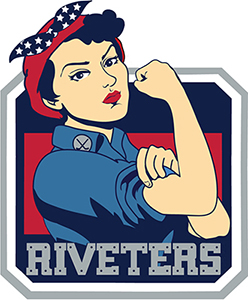
Improvements
Moved the grey border between the fist and head to go straight across, rather than at that awkward angle.
Enlarged the red background rectangle to better balance the flesh elbow mass and better frame the Riveters line of type.
Better kerned the V and T in Riveters - tightened them up which pulled that line in so the lower outer corners don't break out of the background shape.
Some designers aren't sure when to stop


I was out front doing some yard work when a guy stopped by asking if I wanted the fall leaves raked up. Yes!! I do!
He did the job and, as he was leaving, handed me his card. It was a very nice card - it commanded attention and conveyed the info clearly. The script type of the name 'Eden' conveys organic plantform and the green leaf serves as a visual barb to enhance memorability, helps convey the type of business, and respects the name 'Outdoor'. (His name is not Pat nor is that a real phone number.)
But, there is that lonely white line before the word Outdoor. Why? What is it there for? How does it enhance communication or help convey the attitude and image of his services? I can't find a reason. It just pulls attention and focus away from the green leaf. That unnecessary line is embellishment, adornment, and decoration.
Lessons
• Great design has no need for embellishment, adornment, or decoration.
• Great design is knowing how much to remove, not how much to add.


Left: Line removed. Middle: Outdoor aligned left. Right: Outdoor enlarged and aligned with Eden, which helps emphasize the leaf.
A few quick graphic marks for tornado-damaged Moore, Oklahoma


Above: some of the marks posted on Facebook, none very good. Below: the best one, by Andre. It includes a direct emotional appeal and a mental play on words: Help more & Help Moore. The mark conveys clarity, alignment, passion, wit, and warmth. Nice job, Andre.

Bull fart


Okay, let's try to find the intended meaning in the mark:
OkieBull
Slaughter guts (see the ripped off butt blood and guts)
Bull farting out Oklahoma
I just do not know what is going on with his feet - but they don't look right. But, then, neither does his tail or butt. I'm not sure a restaurant should emphasize a red butt so prominently.
You probly have more fun meanings, and we could go on and on, but we're not likely to come up with anything that is appetite-enticing or suggestive of a quality bbq & burger restaurant.


Great logos should maintain clear communication when reduced and when printed in one color only.


Observations and lessons
Consistency: Is it Bar-B-Q or BBQ - the door, logo, and website copy alternate. Tip: Pay for great design and for all the applications.
Readability: serif typeface with thin strokes is tough to read. The serifs are a wise choice to convey the western bbq mood, but, remember, the designer is in control of the mark - fatten or bolden the strokes to provide a better visual weight.
Visibility: Explore and consider contrast, value, color, point size, typeface, case, and on and on. Great designers thoroughly consider all the Design Components and are meticulous about attention to detail.
Does the new Taco Bueno logo include a fart cloud?


Granted, Mexican food, especially the beans, does encourage such action, but should it be promoted on the sign? Should it serve as an identity for the restaurant?


Progression of Bueno logos The fart may have been an attempt to connect to the prior logo with the word Bueno in a bubble. But that one makes sense - someone is exclaiming 'Bueno', as in 'Good' or 'Let's go there!' The new mark has the bubble emanating from Bueno, not including it. It is empty as if someone is saying nothing. Or it is, in fact, a fart cloud.
The University of L J or Elljay University


I bet the first time you saw it you read it as an L and a J. Most people do. But, because you likely saw it on television during a football game or a sports segment of the news, the L J logo was accompanied by the name Miami. That association helped the viewer learn that the L J stood for the University of Miami.
Important: We would not have learned the meaning of the L J if not for the repeated exposure on national media.
Most logos can't rely on repeated national television exposure to educate the public. BTW: it would sure make a great L J U logo:


Logo for the Union High School in Tulsa Oklahoma:


History of the Miami logo
From the U of M website by Lyssa Goldberg, 2012 (comments by Jim)
Miami athletics had gone through several years of uniform and helmet changes, with inconsistent logos ranging from an M to UM. The Hurricane Club commissioned a Miami publicist, who worked with a graphic artist (artist, not designer) to develop this logo in 1973. The athletic department was looking for something that would symbolize the University of Miami without having to say those words (like almost every other logo). The letters UM were not enough because they could have represented many other schools. (If UM could represent many other schools, the U could represent many more.) "It was quite a stretch," said one of publicist's daughters. "They took the U and said, 'This is the University.'"
The Athletic Federation ultimately wanted people who saw the split-U to automatically think of the University of Miami (automatically required years of repeated exposure). "Beyond our wildest dreams, this is what happened." (all logos want people who see them to think of the company it represents - not really such a wild dream.)
Simply saying The U did not cause any confusion because there was only one university in Miami. "If someone was referring to the university, you knew it was UM and the U symbolized the university." (but what about all the people outside of Miami?)
In 1979, UM President Henry King Stanford sought to find a replacement for the U logo. The Graphic Department chair felt the U could have represented any university (good for them). But, students launched a "Save the U" campaign.
Conclusion: There seems to be no strong rationale for why just a U - a U that is in thousands of University names. It's just a lettermark that, with lots of exposure - time & money - viewers have learned to associate with the University of Miami.


See the sign in this strip mall between a Pawn Shop and a Smoke Shop. Guess what product Humble Pie sells.
Assess the font selection (a 1930s era Art Deco style), the color (black & white), the arched baseline over the word Pie, and the name itself - Humble Pie.

Yes, of course, all of that says Pizza! Another good example of a sign company 'designing' a sign.
What letters are these?


I can't get past the letter A - it's quite strong for AA. Or, maybe RR.
But, I guess those are the letter D - the entity is Death with Dignity. And what is that arc bridge-like thing?
Great news - Death with Dignity tweaked their logo:


They saw the light - those marks were not being read as Ds. Now, maybe they will pay some attention to the text type. Above right: the throwaway 'with' has more weight and is paired with 'Death' - now there are two lines just as there are two D marks - and the text respects the Ds by aligning to the arc:


1. The forced spherical perspective on the text just doesn't work.
2. 3 different point sizes for 3 short words is about 2 too many.
3. The word Cue is larger than the words On and Express which are just as, if not more, important.
4. The yellow dot is distracting and slightly annoying because it is off-center in the red oval.
5. Letter C that forms an arrow going in a circle just makes no sense. That motion doesn't relate to pulling in for gas, a billiard ball, or an actor's prompt for the next line.
6. There is no clear hierarchy of elements to control the viewer's attention. There are just too many disparate elements fighting for attention.
What is the concept of this identity? A yellow cue ball? A red squashed ball?
Lesson: A successful design or ad must be based or a concept that is logical, impactful, and clearly communicates the message.

In 2012, The Philbrook Museum of Art sought to update their brand. The timing coincided with an expansion into a satellite facility in downtown Tulsa. The museum hired the New York City office of Pentagram, an international design firm. Above is the new mark.


Some examples of the new mark on a brochure, the stationery, and, below, two web pages showing photos with annoying grey squares.


The rationale of the design concept

The rationale given by the designer is that the mark is a square with two voids for the two locations of the museum. They placed a grid over a map of Tulsa and saw that the two voids formed a capital P when contained within a random square. The resulting P stood for Philbrook and represented a person.
But it is a weak concept. Here's why:


Lesson: a contemporary mark and a slick execution can't compensate for a bad idea.
Some people will be fooled by the 'modernity' but thinkers can see past the presentation. Great design should appeal to the more thoughtful audience.
Important lesson: Great design must have a great concept as its foundation. Everything else depends on, supports, and builds off of that.


A new science museum opened in downtown Dallas in December, 2012. It is spectacular - the building itself is displayed as a major exhibit. The galleries inside are very well done with much interactivity and plenty of intrigue for both adults and younger visitors. There is a nice theater for 3D films, a cafe, and the required gift shop. But, look at this weird logo with the red gimmick brackets:


A major donation to the museum came from the children of Ross Perot and the museum is named in his honor. The logo was designed by a team from Pentagram offices in Austin and New York City. The building's shape was their main inspiration:


From one of the chief designers, "A cube can be represented by a simple pair of square brackets; and brackets, like parentheses, are literary marks that introduce additional explanatory content into a passage. The new museum is a cube filled with explanatory content. I like the dual symbolism of the brackets in the new mark.
The contemporary red brackets contrast the intentionally classic and timeless wordmark set in upper and lower case Caslon, and are also used in the website and environmental graphics."
Issues
That much deciphering might be okay in an ad or brochure, but not for the identity. An identity should communicate its message quickly and easily. Most of us don't have enough time to decipher logos. Not that a logo must be simple - it can be complex, but the elements should enhance the clarity of the communication, not distract. In this logo, the red color and the sharp-angled bracket shapes do not respect the globe nor the letterforms. Therefore, they become just a gimmick - they don't add value to the communication of a message (like that used in the shutterstock ad).


Lesson: A larger bright red element in a mark almost always intrudes.
We are too conditioned to see red as dominant and to see a larger size as dominant.
I wondered how it would look with the concept of simply replacing the letter O with the globe:


The open compass is an appropriate and strong image for a guide that helps one find one's way around the site. But, notice how obnoxious and demanding the large red brackets are - they become the defining element even though they have no relevance to the experience of the museum or the Visitor's Guide. The compass has to compete and fight with the red bracket crap. The compass is also a photo realistic dimensional image which is flattened by placing the 2D brackets on top of it. On the right, both the compass and the logo globe are free to convey dimensionality. (I also made the text copy larger to improve readability on the cover.) The Visitor's Guide is handed to visitors - it does not need to get our attention.
Lesson: Sometimes, too often, designers crap things up with too many unnecessary graphic elements.
Tip: Great design is often knowing how much to subtract, not how much to add.


After the OKC Energy FC (Football Club) soccer team introduced their new logo, a blog poster noticed that the Energy logo had similar elements to the Seattle Sounders FC logo:
Banner containing the team name
Object above the banner name: top of space needle and OKC
Letterform serifs (see the Rs above right)
Shield with straight-line top: convex and concave
It seems that the Seattle logo (April 2008) inspired or influenced the OKC logo (November 2013).
A better YMCA logo


The logo on the left above, with the bent black bar, was introduced in 1968 - the red triangle was introduced in 1891, the 3 sides represent spirit, mind, and body.
The identity in the middle, introduced in 2010, reflects the public's reference to the YMCA simply as The Y. The bent bar forming an arrow is a nice touch for an entity that helps people grow and move forward, and the new mark has ample references and similarities to the former mark to ease the transition and education of the viewer.
However, the elements in the mark do not respect each other quite well enough. The YMCA text looks like an afterthought and the 'the' is too far away and not aligned or related to any other element, other than being in the same color. Setting 'the' in upper & lower case with the ascenders on the t and h do not reflect the continuity of the YMCA caps and the bands of color forming the Y.
A better version
The revised mark sets 'the' in all caps to form a band that also serves as the stem of the arrow, aligns 'THE' to the centerpoint of the arrow, moves the 'YMCA' so it is no longer blocking the forward motion of the arrow, and places the YMCA parallel to THE and tucks it inside the triangle. One can read 'The YMCA' or 'The Y'.
Watsonism: Figure out what's working in the piece - exploit that and minimize the rest.
What's working in the new Y logo is the Y also reading as an arrow. That should be exploited.
Lesson: Logos and all graphic design work should be concept-driven.
The concept, the big idea, should 'drive' the piece, directing and guiding all other design decisions. Every element should support the basic concept.


A bit of Y history
George Williams, a 23-year-old cloth and dry goods salesman, founded the first Young Men's Christian Association in 1844 in London with the purpose of "improving of the spiritual condition of young men engaged in the drapery, embroidery, and other trades." At the time, the Industrial Revolution was still condemning many urban dwellers to poor working and living conditions. Like other industrialized cities, much of London was overrun with pickpockets, thieves, prostitutes, beggars, drunks, and destitute and abandoned children - conditions that Charles Dickens exposed in such novels as Oliver Twist and Hard Times. Williams and some fellow drapers sought to alleviate the gloom of the working class by providing Christian fellowship, prayer, and bible study as an alternative to the squalor of the streets. Their efforts were very successful, and the movement quickly spread. By 1851, the movement had spread to North America, first to Canada, and then to the US, where a YMCA was founded in Boston.
James Naismith, a Canadian, invented basketball while at the YMCA in Springfield, Massachusetts. Naismith had been asked to invent a new game to interest young people in physical exercise. The game had to be interesting, easy to learn, and easy to play indoors in winter. In 1895, William Morgan from the YMCA of Holyoke, Massachusetts, invented the sport of volleyball as a slower paced alternative sport, in which the older Y members could participate. The New York YMCA had proclaimed a fourfold mission: 'The improvement of the spiritual, mental, social, and physical condition of young men.' By the end of the 1800s, the fourfold purpose had been revamped into a triangle: spirit, mind, and body.


Logo design lessons
A designer sent me a logo (left above) that he was working on for a client that he had a good relationship with (referral business). He asked, "Critiques?" I obliged with some observations:
One roof is probably enough to say 'house'. More becomes clutter.
• Squashed low windows add nothing, and attract attention to themselves due to their uniqueness.
Three point sizes on one line (too many): F&E, T&T, IRS&IM. Different sizes here add little value.
• Base capsule and title are not aligned - the F & E are not supported by the foundation.
• Grey capsule is a bit too thick and heavy. Doesn't quite respect the weight of the text above.
The concept seems to be - the stylized image of a house that also conveys the side-by-side letter Ts in the brand name, FirsTTime. That's solid: clear, memorable, and effective. The house is conveyed by a roof peak, a chimney, and a front door - nice images for home buying: shelter, warmth, and welcoming entry.
The differing point sizes, windows, a porch roof, and a heavy base do not support the concept. Clarify the mark by keeping only the necessary elements - let the concept work on it's own.
Lesson: Figure out what's working in the piece. Exploit that and minimize the rest. The 3 house elements (roof, chimney, and door) are working. Other elements don't clarify or add memorability.
"When I sent the first draft (that was very similar to your revision) to the client they thought it looked 'blah'. I added the porch roof to define the 2 T's a little better, the windows to add some life to the home, and the yellow to show the lights on. Adding the porch roof and the lighted windows added life and warmth to the house and gave it a little more character, not so monopoly piece simple/'blah'."
Lesson: When you catch yourself adding something to address a weakness, stop. Assess what caused the weakness - if it is legit, then address what caused the weakness. Adding more stuff to a logo rarely works. From Bound for Glory, by Woody Guthrie:
"Any damn fool can get complicated. It takes genius to attain simplicity."
The 'Blah' comment is a fairly common client response. They rarely see the work through their customer's eyes. The potential customer is seeking help with buying a house. They seek a firm that is professional, trustworthy, honest, and knowledgeable. An ad should not be blah - it needs to capture and hold the reader's attention, but, a logo almost never needs to get our attention - it is usually a side note to a headline, illustration, or text copy. It needs to be easily and clearly understood and memorable. What the client should want is for the customer to remember First Time Realty, not that there is a cute detailed image of a warm house with a porch and with the lights on.

A while back, I was helping the ClockTower Studio students, Jeff and Jenkin, with a project. The client was the Character Council of Edmond. The project was to develop an identity that they could use on graphic materials (stationery, posters, certificates, etc.) It's tough to create a graphic identity for an attribute. But while exploring the letters in the word character and discussing what the group is about, I noticed that another word was nestled inside character, while realizing that good character is useless unless one acts on that character. Without action, character has little value. Acting is the manifestation of character, the next step, the impact on a culture. That notion justified the concept with some strong rationale - the mark could now go beyond a clever type treatment of some letters and convey an additional and important meaning. Jeff and Jenkin set in all lower case to convey that character was not something to shout at someone - it was a more subtle under-the-radar attribute. The above mark shows the essence of the concept that the students presented to the clients. They loved it. They agreed with the rationale given in the presentation and loved that action was involved - a command to the viewer to act, to do something.
Tip: Explore, sketch, research, sketch some more, do more research, and become an authority on the subject and all its components.
Lesson: As April Grieman, Paul Rand, Herb Lubalin, and numerous others have preached - often, the solution is inherent within the problem. The more you understand the problem, the easier the solution becomes.

Above: Their website banner. Below: Mundane logos from other councils:


This logo conveys each of the 4 components in the festival name:
American: red, white, and blue; stars and stripes
College: the mortar board tassel, the pennant
Theater: the familiar Comedy/Tragedy masks
Festival: The waving banner, bright colors
The regional festival logo, was used extensively on collateral material (stationery, signs, fliers, program covers, folders, and nametags) that. Three students - Adam, Adrienne, and Elizabeth - in ClockTower studio created the mark during the summer of 1992.
Oklahoma City Public Schools is proposing a new identity
A survey was sent out that showed the 3 finalists in preliminary judging. These are the options, with my comments:

1. The figure is a bit too awkward - a person with multiple heads, juggling balls, balloons, tree with weird fruit? There doesn't seem to be a clear meaning behind the mark. Its just too random. The text type does not relate to nor respect the mark - they're just near each other.

2. This one reads clearly as Kansas City Public Schools or KCPS, a radio station's call letters. The apple mark doesn't form a good letter O. The apple symbol for education is a bit overused and is now just a trite cliche.

3. The synchronized sperm swimmers may not be a good message for public school students. The mark serving as the letter O is too extreme - not enough connection between the sperm ring and the rest of the word Oklahoma. The circle of swimmers does represent the runaround of going in circles in school administration. The synchronized figures suggest all students fit into the same pattern - other than color, it denies individuality.
4. One could also vote to keep the current logo:

The existing mark has the best concept - a figure reaching for the stars. But the text type is too clunky and dated.
A better proposal

The existing logo with improvements to the figure and text
The figure:
• Provides continuity to the existing familiar logo.
Is a brighter and more lively blue.
Has lost a bit of weight.
The head of the figure is the same shape and angle as the O in Oklahoma.
The star:
Is rotated to a more familiar and stable orientation.
• Is centered between the hands.
• The text:
Set upper & lower case in a friendly font.
Italicized to suggest forward movement and growth.
Tucked into the figure to better integrate the two.
Tag line forms a stable foundation as public education provides a foundation for lifelong learning.
• The colors:
Green and blue are eco earth colors; blue sky, green grass.
Green represents the growth of the student and of the district.
Tag line about preparing students and the student figure are the same color.
The new identity is lighter, more agile, and more appropriate for a district heading into the future.

Lesson: Strive to integrate all elements of a logo. It is an identity that should hold as one cohesive unit.
The Starbucks metamorphosis

As we have witnessed many logos simplifying and removing elements, many predicted that Starbucks might just keep going until their logo was just a green disk. They put out their seasonal displays and, sure enough, there is the green dot.


At least, H&R Block is using a shape that has a slight connection to their name, although a square is not a block (a block is 3-D, like a cube - a square is 2-D.) But, there is no connection to the USA or 'Today' that justifies a flat dot as an appropriate symbol. Some 'design firm' got paid big bucks for the no-concept USA Today symbol. They sold it to the client and conned the public into believing it is good design. Fortunately for them, the public has gotten numb to design, the standard for thoughtful design has been lowered so far that almost anything can pass today as graphic design.
New OKC Transit logo


It seems that the concept has something to do with direction, movement, and access; as conveyed by 4 arrowheads going in each cardinal direction.
The Transportation and Parking Authority adopted the brand name EMBARK for the services it provides - including revamped bus service, parking garages, and the downtown streetcar. Research showed 45 percent of the public did not know the name METRO Transit - the former name for the bus system. (I don't know if we need to know the name - I suspect most people just called it the 'bus'. Like, "I'm taking the bus.")
The authority said EMBARK "captures the spirit of where we're headed and implies togetherness and an invitation. It makes the transit system a journey we as a community undertake together." (I can't decide if that is just PR bullshit.)
However, it's a stretch to see 4 arrows, with two leading the eye away from the mark, as togetherness, an invitation, or a journey taken together. Maybe, 4 journeys about the city. Motion is not clearly conveyed by blocky, vertical, upper case sans serif letters and the colors grey and blue. Motion is often seen as italic type and colors that are lively (red and orange) or growth (green). Not that those are rules or to be expected. Breaking from expectation can sometimes be effective. Below left: blog reader Sean submitted this improvement:

Simple changes and much better: the arrows are more subtle, the font conveys motion, and the color is lighter and livelier. Hmm, let's see how it works in two colors - keeping the blue arrows from the original. And, below, with blue letters and blue with green arrows:
Logos don't need legal names


Reminder: logos are identities, they do not need to include the legal name of the company. Inc. and LLC are types of corporations and need to be clearly communicated in legal documents, but not in identities for the public. Often, the public doesn't care and it just then adds unnecessary information. In addition to adding the task of having to deal with some awkward punctuation. Excluding legal info may entail a discussion with the client on how to best convey a clear identity to the target audience.
Lessons
Designers often have to educate clients about communication design.
Develop design solutions primarily for the reader/user/audience, not the client.
Driving between NYC and Oklahoma, much of my attention is on the graphics along the Interstate - billboards, hotel signs, personalized license plates, etc. Here are 3 examples of logos on trucks.


Upper: This is a decent mark - simple, clear, with a bit of cleverness (the 3 crowns forming the letter I). But what might keep it from being great is the placement of the word Services. The concept in this mark is those 3 crowns that serve as visual images and also form enough of the letter I that we read the word Triple. All elements in a logo should enhance the concept. But here, that word Services fights the concept by pulling our attention away from that main element. Lower: A draft of a reworked concept:
The lower case word Services under the straight baseline of the wn captures some awkward spaces in between. Setting Services in all caps solves that irregular outline and better respects and relates to the straight baseline underneath the Tri.
Moving Services helps it relate to the Triple Crown by aligning it beneath the T and butting it up to the P. The new location helps emphasize the 3 crowns by providing a foundation base.
Aligned the bottom of the lowest crown with the baseline of Triple Crown.
Decreased the gaps between the 3 crowns - this relates them better as a unit - the crowns are an element that has to do double duty: be read as crowns and be read as the letter 'i'.
Tightened the word spacing between Triple & Crown.
Lessons: Figure out what's working in the piece - exploit that and minimize the rest.
Good logos often have a single focal dominant element that is memorable. Enhance that primary element and minimize the others.


This could have worked. Its a bit of an overused cliche - jutting a star into angles of letters in a word, but it can still do its job here. However, in this case, the relationships among all the angles need attention. The integration of the strokes of the star and the strokes of the letterforms is so clumsy and awkward that its jarringly uncomfortable. Just too much inconsistency: the angle of the slash between the S & the T, the gaps between the A and the T & R, and line weight in the letters and the star. The designer needed to pay greater attention to detail to resolve these relationships.
Relating a point of the star to the letter A is a natural - they have built-in commonalities, but maybe its too common - the star and the R might work, if it is resolved better than shown above.


The Oklahoma Aquarium opened in 2003 in Jenks, just across the Arkansas River from Tulsa. It is a great facility and a welcome addition to other world-class museums in the Tulsa area. Well worth a visit. But why do people go to an aquarium (or a zoo)? To see life. Activity. Motion. Color. To see creatures that we don't normally see. To have new experiences. To see fascinating life forms.
But look at the logo above. It works well as a professional image, but, as with almost all logos, it could be better:
It doesn't quite convey what an aquarium represents. It is condensed, straight, centered, primarily black; solid, static, and boring. It doesn't have enough life and movement. Even the image is that of a shell - an empty house for a sea creature - not a creature or animal. The website includes animation of fish swimming - motion and life. The identifier should also.
Lesson: an identifying logo should represent the positive aspects of the experience.
Tip: List descriptors for the entity (in this case: life, action, motion, color) and design a mark that clearly conveys those.


Bonus tip: In this brochure on the right, there is pretty neat image of a shark, about to swim right off the page. But with the static logo placed right on top of it, the dynamic shark image is ruined.
Lesson: Photographs can add depth and dimension to a 2-D piece. Avoid limiting that depth by putting text over the image.
Your innate design sense and The Jim Rome Show logo
The Jim Rome Show is a sports radio talk show hosted by, yes, you guessed it - Jim Rome. Syndicated by CBS Sports Radio, Jim Rome airs live from Los Angeles, on more than 200 radio stations in the US and Canada, and over the Internet from Rome's website.

These early logos relied on his initials, which is a symptom of poor design - unless people refer to an entity by it's initials, initials rarely communicate effective identities. The logo he currently uses, below, is better - no initials, no adornment, just the straightforward name of the star of the show. He is selling himself, his name is the appropriate brand. It is his unique label, used throughout the show and the website. Uniqueness in a client name should be considered for exploitation. Use what is inherent in the design project.

But, something should annoy your sense of design:


The clever stack of 3 blocks in the R are neither respected nor exploited in the E on the right. The E is almost a stack of blocks, but the middle arm does not align with the upper and lower arms. It is too close for comfort. Almost there, but not quite, the designer didn't go far enough. So simple to make it match the left side. The JR mark, top right, a pseudo-ligature, may have been the inspiration for the R in the current logo. The 'designer' deleted the vertical stroke of the R to butt up to the J or considered the JR to be a ligature.
On the far right:
1. The block under the R is a similar width to the letterstroke width.
2. All three arms of the E align flush on the right side.
3. The kerning is tighter in the line THE JIM ROME SHOW. The improved spacing allows easier readability and allows that line to be enlarged which helps its mass better support the ROME above it.

Some issues
Too many gimmicks to draw the reader's attention: recycle symbols, ata in red, horizontal dash lines, ADS in larger point size.
Recycle symbol is inappropriate - we want sensitive documents to be unusable, not recycled into another form, even if that new form is unusable - its the concept of recycle versus getting rid of it.
Is that another recycle symbol as the dot over the i in 'Shredding'? That's just excessive. And silly.
Why are the letters 'ata' emphasized in red? I'm stumped. I can't relate ata to anything about data, shredding or absolute.
The dash lines - I guess that represents shredded paper. But, I suspect most people would imagine shredded paper in a vertical motion, as if coming out of the shredder. Why are these different thicknesses and lengths?
Why the emphasis on ADS? Will people really call it that. Doubtful.
The angled left margin serves no useful purpose.
Lesson: The list above is some of the issues that the designer should have asked him/herself. We can't depend on clients or printers to ask intelligent design questions. It is the designer's responsibility to objectively assess and improve his/her own work.
Quick - what letter do you read in this logo?


Answer: B, a very clear B. Congratulations.
However, we are all wrong - it is a mark of an L and an R. But, when one abuts those two letters in low-contrast colors (white and yellow), it reads as a B.


This is the new identity for a copy and print shop, right across the street from a university. This store has been in business for about 10 years. People knew it as 'Advanced' or 'Advanced Printing'. I wonder why the name change? To a weird acronym? What is the new name? Is it Apmok? APM OK?
And, what are those 3 balls for? They are not copies of each other. Beach balls? Weird Pepsi logos?


This place even offers 'design' services. But, their new logo represents much of what is wrong with design today - amateurs thinking they are designers and producing thoughtless work. Visual art, not design. If you are proposing a new unusual name, avoid adding unnecessary confusing graphic elements.
Lesson: an identity should convey the essence of the entity, in a clear, easy-to-understand manner. It should be appropriate, memorable, and effective.
Roofer Yard Sign Contest

After a hail storm in central OK, roofing signs popped up in many naberhoods. I won't go into the scam that involves insurance companies and roofers, but it has been interesting to observe the variety of signs for the roofing companies.
Contest criteria
Easy to find phone number, graphic appeal, noticeable from down the block, clear message of roofing (text or graphic), memorability, quality and professionalism conveyed.


Forrester Brothers: The portrait orientation and the simple graphic set it apart.


Edmond Roofing: As blog poster Joe from Chicago noted, the phone number is can't-miss-it big and the single word roofing helps memorability - the word roofing and a phone number. Nice. The web domain name is also logical and straightforward. I explored flipping the mark so it read better as an E:
Original on the left. I removed the 'leg' extension - the mark read as an 'F'. While I typically am not a fan of initial marks (most people don't refer to a company by its initials) - this one seems to work because the E mark does double duty as a roof.


Excel: The diamond orientation helps it stand out, but the miserable logo and cluttered copy make it less appealing. Here are some design elements to address:
Alignment of elements help create order and continuity.
Consistency of line, color, serif, stroke weight add to the cohesiveness of a mark.
A single strong concept for the viewer to focus on aids understanding and memorability.
Each element in a piece should be supportive of the concept - they should not fight for attention - the hierarchy should be easy to follow.
The level of craftsmanship should be of high quality to convey professionalism, trust, and integrity.
Do we really need all these items: the Star of Bethlehem, smoke coming from the chimney, a chimney, a black peak forming half of the letter X, serifs on half the X, a black line connecting the strokes of the L, a red line under the word 'roofing', or an extra stroke extending off the E?


Statewide: One of the least well thought out:
1. The legibility of the name is diminished by the red on red, the busyness of the outline font, and the cluttered background.
2. The sign has the mailing address listed first. I doubt any passerby who might be considering a roofing company would jot down the address and go home and write a letter. They are more likely to make a phone call right there while looking at the sign and reading the phone number or maybe even check out the website. This address also tells the reader that the company is on the other side of the metro, in another town (not local).
3. The web domain name,'stater fg', is a bit odd. As of this post, www.statewideroofing.com was available.
4. The most used contact info - phone and website - are separated by copy: Bonded-Insured.
The sign probly looked great on a computer screen. But, as is often the case with poor design, the designer didn't create the piece to succeed in its appropriate environment.
Lessons
Remember to design for the user, not for yourself or the client.
Consider contrast when selecting background colors on signs.
Determine the hierarchy of text copy based on what is most important to the reader, not the client.
Proximity is a major design principle - group like items (phone and website) together.
Weak rationale for a mediocre logo


Above is a page from the logo section of the 2011 Design Annual issue of Communication Arts magazine. Notice the logo for a law firm, Hewitt Wolensky. It is nothing great - tired and trite use of initials to represent a firm that no one on the planet will ever refer to by its initials. But, what stands out as even weaker is the 'rationale' given for the logo:

"classically combines" - just what does that mean? What is classical here?
"strong vertical pillars"? If one does see pillars (doubtful), they are open-ended, thin, and fragile with unstable rounded bases - not strong.
"network of paths in the white space" - there are two paths that aren't even connected, so, not a network. And why emphasise the white paths - they don't help convey the H or the W and they don't seem to fit the attributes of a law firm: trust, professionalism, expertise, or success.
"clean, contemporary mark" - clean? the letterforms are gradated. Contemporary? what does that even mean?
"a mark symbolic of this new law firm" - how is it symbolic of a law firm, new or old?
"establishing a new paradigm in its field." - what? Paradigm is one of those words (like clean and contemporary) that people use when they don't know what to say but feel they've got to say something.
What concerns me most is this: the profession of graphic design is still striving to establish itself as a respected profession - there are people who think 'anyone can do it', and there is an abundance of poor work all around us. Bullshit rationale only serves to reinforce the notion that much design is done by amateurs.
Tip: Rationale is very important for designers to provide to clients. But the reasons behind design decisions should be honest and true.
Lesson1: Most people can see right through weak bullshit posing as design rationale.
Lesson2: Just because a piece is accepted into a Communication Arts annual doesn't mean it is good design.
Nice job of incorporating numbers within text


Someone actually made the weak Thunder logo even worse


Wandering through the mall, I came across a kiosk of phone skins where I immediately spotted the squished Thunder logo (and Cowboys logos). That looks horrible. The kiosk operator looked confused at my comment. You ruined the logo. You squished it. "But, I had to make it fit!" You could have just made it smaller - like this one (I pointed to the Thunder logo two rows beneath - it fits and its unsquished, like those on the right). I do give this guy some credit for staying somewhat calm - I was berating him in the mall for the crap he was producing. One of the reasons we see so much design crap today is because there is not enough public flogging. I remember when the Thunder logo was first introduced, the Oklahoma AIGA chapter refused to make any statement or comment about the weak logo. The very organization dedicated to improving design in Oklahoma was too afraid to rock a boat or ruffle feathers.
Lesson: We often get what we deserve.
Actually, the kiosk guy and I had a good civilized chat. After my initial reaction, I talked to him about logo identities and the importance of consistency in reinforcing brand awareness. He agreed and we parted on good terms - he even allowed me to take the photos for this blog. So, why do people do this? How do we educate them that there are more options for 'fitting' than grabbing a corner handle on a computer screen and moving it to the 'correct' shape? Sometimes the abundance of crap is overwhelming and it seems hopeless that we might ever overcome it. One option is to speak up and discuss design with those who need it.
The newest NBA logo


Yo! The Brooklyn Nets developed a new identity when they moved from New Jersey to their new home, the Barclay's Center in Brooklyn.


The identity includes two logos. The primary, is in the all-too-common shield silhouette and the other is a circular emblem. Created in part by the team's minority owner, Jay-Z, both logos, as well as the team's colors, will be in a black and white scheme, which adheres to Jay-Z's motto of "All Black, Everything". The colors and the style of the text lettering pay homage to the old New York Subway signage system:


Shawn Carter (Jay-Z) is one of the most financially successful hip hop artists and entrepreneurs in America, having sold approximately 50 million albums worldwide, while receiving fourteen Grammy Awards. "The Brooklyn Nets logo is another step we've made to usher the organization into a new era," he said. "The boldness of the designs demonstrate the confidence we have in our new direction. Along with our move to Brooklyn and a state-of-the-art arena, the colors and logos are examples of our commitment to update and refine all aspects of the team."


Some observations
Shield, name placement, and moving ball reflect much of the feel of the New Jersey logo - to maintain a bit of consistency between the old and new and to aid branding in the consciousness of the fans - keeping team look but adapting it to its new naborhood.
Kerning is awkward in NETS - the tight space between the N and E does not respect the air and room between the E & T & S.
The word Brooklyn is a nice match to the Subway signage.
The condensed type is well done - designed as a condensed font rather than manipulating a font on the screen.
Lesson: Specify a condensed font, do not condense a font with the mouse.
Capital B over the ball cancels out the dimensionality created by the detail lines in the round basketball.
• Colors, black & white (only team in the league with those colors) is okay - might work. Much of the philosophy given for the logo and the team is to relate to old-school Brooklyn athletics. Some Brooklynites have never accepted the insulting loss of the Brooklyn Dodgers. One of the logos for the Dodgers was the capital B inside of a circle (below), apparently inspiring the Nets' B in the circle of the ball.


Other NBA balls in motion: None of these balls have a flat letterform placed over them, stopping their dramatic motion.
Lesson: While this is not a 'bad' logo, it is certainly not an example of excellent design. The numbing of the American design consciousness continues on its downward slide.
Below: results of an online poll.

Speaking of the Dodgers
Established in 1883, that team originated in Brooklyn. In the 1891 season, the team moved to a ballpark which was bordered on two sides by street car tracks. That's when the team was first called the Brooklyn Trolley Dodgers, soon shortened to Brooklyn Dodgers. The team is noted for signing Jackie Robinson in 1947 as the first black player in the major leagues. The team moved to Los Angeles for the 1958 season.
Why the Oklahoma City Museum of Art logo is not ready for the major leagues
Enjoying art is about an experience - a connection that impacts the mind with images that are both familiar and innovative. Experiencing art can sometimes result in chaos, but, most often, it results in a feeling of enlightenment, inspiration, and joy. Sometimes chaos in logo design is appropriate, like in Punk and Deconstructivist work, where it can be a good fit for that specific audience. But, usually, design is about creating order to better communicate a message. The target audience for a major Art Museum is typically people with money who desire an aesthetic experience and inspiration. Granted, logos for art museums are tough - how to best represent the diversity of art and distinguish the museum from others. Often, designers will turn to the name, relying on typography and letterform relationships. But that puts a huge burden on the type treatment to be memorable, unique, appropriate, and accurately represent the art experience.

The OKCMOA logo consists of two parts sitting side by side - the initials stacked on 2 lines and the full name stacked on 3 lines. The logotype for the full name is quite strong - the lines of type changing in point size can symbolize motion and growth as each line gets larger, the line containing the word ART is the largest, and the mark is orderly and organized with the justified margins. While it still needs some professional tweaking in its alignment and word spacing, it works quite well.


But the mark of initials - not so good:
Tip: alignment and consistency help create order. Order, not chaos, most often clarifies understanding of a mark's meaning.
Lesson: a logo is an identity that should convey the qualities, attitudes, and user experience of its company.
Good news: the OKC MOA logo has been improved.
Saw the new version (below left) in the fall of 2015 - it has been tweaked a bit. No more awkward K nor annoying spacing. The kerning has been improved and Museum of Art is slightly bolder.


Above right: I tweaked it a bit more - made the Os and the C more consistent, improved alignment, removed the unnecessary period after W, and enlarged the baseline of text.
More OKC Art Museum of Art design improvements.
How to improve the Verizon logo


Above left: Verizon introduced a new logo in September, 2015. The boring typeface, straight baseline, and all lower case make the new logo worse than the preceding one in the middle. The tiny check mark (that doesn't relate well to the text) has no intuitive meaning for phone service, and is placed in an awkward and precarious position - it is begging to slide off the hump of the 'n'.
The former Verizon mark could easily be made better. Here are some areas of concern:


1. Just too many different angles.
2. Too many different directions leading the eye away from the mark.
3. Different weights of the red lines.
4. Three dominant elements are too inconsistent.
Improved version on the right
An adage to improve solutions is Figure out what's working in the piece; exploit that and minimize the rest.
A mark is usually stronger with only one dominant unique barb. The red check mark and the red letter Z are fighting with each other to demand the viewer's attention. The red Z provides a unique identifier that exploits the unusual spelling of the name. The check mark has no positive value - it is not a symbol typically associated with cell phones and it is an overused cliche.
It is really easy to make the Verizon logo better - simply delete the check mark.
The unique red Z becomes the main visual identifier. The logo is now stronger as a mark to be remembered and is now more adaptable to a variety of surfaces and uses.


John McWade picked up this Verizon logo essay and linked it in his Before&After website, April, 2010:


The graphic icons in the logo appear to be a red diamond and an empty dolly. Well, two dollies - I guess they are really important. And more smaller red diamonds.
Lesson: Icons provide a barb for the viewer's mind to grab onto. An identity can be more effective if those icons relate positively to the audience's needs and desires. Seldom does a potential customer for a moving company think first of a dolly. Or a diamond.
Tip: Avoid obscure icons, even if they are easy to download as Google Clip Art.
The black word 'Moving ?' is tough to read when placed on top of the red diamond.
Lesson: Contrast can improve ease of reading and clarity of message.
Tip: Avoid black on red and red on black.
Another logo with too much going on
The Udig logo has too many barb elements. A barb is the part of a logo that hooks the mind and sticks in the brain to aid memorability. But, if there are too many barbs, they can cancel each other out, look chaotic, and impair memorability.


Udig publishes short, curated, and collectible e-books with comic content. The owner, Andrews McMeel uses the U-face mark and they may have wanted some continuity between Udig and Andrews McMeel. Not sure that's important - maybe the identity for Udig should be allowed to stand on its own.
The Udig logo consists of these elements:
The word dig set with slab serifs, all lower case, in grey
The capital U set in all caps and in a larger point size than dig
The eyes and nose forming a face with the U
An arc of balls, different sizes and different colors
The clever U-face barb and the arc of circles compete with each other for attention.
There are some options to reduce the clutter and improve the mark:


A better logo for GOOD magazine
Below left: The current logo for GOOD magazine, first published in September 2006. From the cover, "Good is for people that give a damn - an entertaining magazine about things that matter." The more I looked at the cover, the more I realized it was not quite there - the logo was just the title typeset in a condensed sans serif font. Not too exciting or thought-provoking for a somewhat intellectual magazine. Also, it was almost an ambigram - a word that can be read both right-side-up and upside-down. I explored letterform possibilities. I came up with two versions - each of which could work.


Above middle: A rotational ambigram - rotate the G and it becomes the D. The concept with this could be that Good, the magazine, puts a new spin on events and stories affecting our culture.
Above right: A left-right ambigram - a mirror image of GO forming the OD. The concept here could be that Good magazine presents a mirror to or of our culture, exposing all that we see in a new light. I tested the readability and there seemed to be no problem with readability (with either version).
I explored many options addressing the precise placement of the horizontal white gap and the crossarm of the letter G. I had the white gaps aligned in the center of the mark and another with the top of the crossarms aligned in the center. This version aligned the visual masses in the center and produced a more familiar G. I submiitted both versions to the magazine; the response: "We're happy with our logo right now. Thank you."


Original 2012 London Olympics logo on the left. Someone's redesign and editorial comment next to it.
The mark really is inappropriate - it is too harsh, rigid, pointed, jarring, and misaligned to accurately represent the spirit of the games - humans striving to be their very best. When it was introduced, it was met with disgust and derision. However, there were very few instances of it around London or during the NBC telecasts. NBC used its own identity program throughout the coverage.


This logo is so horrible, i really don't think i have to go into much detail. Not about the illustration style of the square cup, the useless initials that make up the cup, the different point size and condensing of type, font selection, colors, wavy river of blue/magenta, alignment of elements, nor Capitalization Of Every Word In The Slogan. Nope, just don't need to go into it.
Reminder: logos are not literal illustrations of what a company does - they are identities that convey qualities appropriate to the company. A coffee break is to relax, energize, socialize, and enjoy the cup of coffee.
This is the logo for the First Council Casino in Oklahoma. When I first glanced at it on a billboard in Kansas, I was immediately reminded of the logo for the magazine Fast Company. The C surrounding the O is quite memorable and effective (the smaller A in FAST is just too contrived and clumsy) Here are two more marks with encompassing Cs:

There are hundreds of examples of logos that have similarities. But, is it necessarily wrong? It could be a coincidence or it could be a copy or it could be somewhat innocent influence in someone's mind. If it is an attempt to draw from the success of an established mark and 'piggyback' recognition - then, that would be wrong: exploiting someone else's work for personal gain. But, if it is a graphic element that is appropriate and beneficial to a mark, then we may be more likely to forgive the similarity.
Develop one brand identity and then stick to it. Consistently.


New identities when companies merge

Notice that when one of these drug dealers opens a new store, the other will soon follow suit, often right across the street.

I realize that Borders no longer exists. But, the concept is still there.

